Figma Slots for Repeating Items
How to convert one of your library's most common patterns

As I talk with design system teams about Figma’s native slots rolling out for early evaluations, conversations invariably start with how a migration will replace Slot utility instances with native slots. I’m pretty quick to point out that “You may not even be using a slot utility for you most common kind of native slot. Have you thought about repeating items?”
This post illustrates many examples of repeating items within a core component library and why it’s been difficult to date to compose them effectively. The solution is Figma’s new native slots, with a more careful architecture of naming, default content, and more granular specs.
Background
Many, many UI components serve as a container for repeating items. This is most common when a component’s purpose is as group containing items, like:
checkboxincheckboxGroupradioButtoninradioButtonGroupavatarinavatarGroupbuttoninbuttonGroup
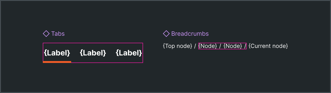
Many components are groups implicitly even if not named that way:
tabintabsbreadcrumbinbreadcrumbsactionListIteminactionListlistItemsin alist
Repeating items also exist in a component area like actions in an alert, toolbar or dialog. Suffice it to say, a repeating item pattern is pervasive across a component library of any scale. As systems migrate Figma assets to native slots, don’t be surprised when you find that repeating items are the most common composable pattern in a library.
Anti-Patterns
Unfortunately, that’s never been easy to enable in Figma component assets. This led to workarounds like instance swapping, hidden layers, and “count” props.
Instance Swapping: Some systems implement repeating items as an instance swap, even creating a row-based convention of instance swaps-within-instance swaps within which repeating items were placed. No thanks.
Users find instance swapping ergonomically annoying
Users had to create a separate component asset to swap in an instance
Hidden Nested Instances: Systems also use hidden layers for extra items, with quantities based on implicit conventions (such as showing ‘x’ layers and hiding ‘y’ layers). Negative outcomes include:
Users drill deep into component layers to find and manipulate items
Overridden instance layer visibility and other nested configurations, an antipattern
Items cannot be reordered
Additional items cannot be added
Degraded file performance due many hidden and often complicated layer hierarchies per instance
Quantity Props: Systems add props like Count to control item quantity. For example, systems may implement an enum Count prop to display 1, 2 or 3 actions in an Alert.
This is composition, not configuration. Avoid it given negative outcomes of:
Variant explosion in component sets
Handoff friction in handoff to ignore props not a part of the “official API”
Item configuration conflation into props of a higher-order asset
All of these approaches are hacks to make up for Figma’s historical lack of component asset composability.
Solution
Use Figma native slots to compose repeating items within a component asset and populate the slot’s default content with a reasonable and consistent number of items.
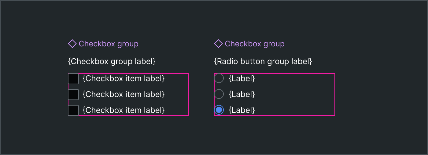
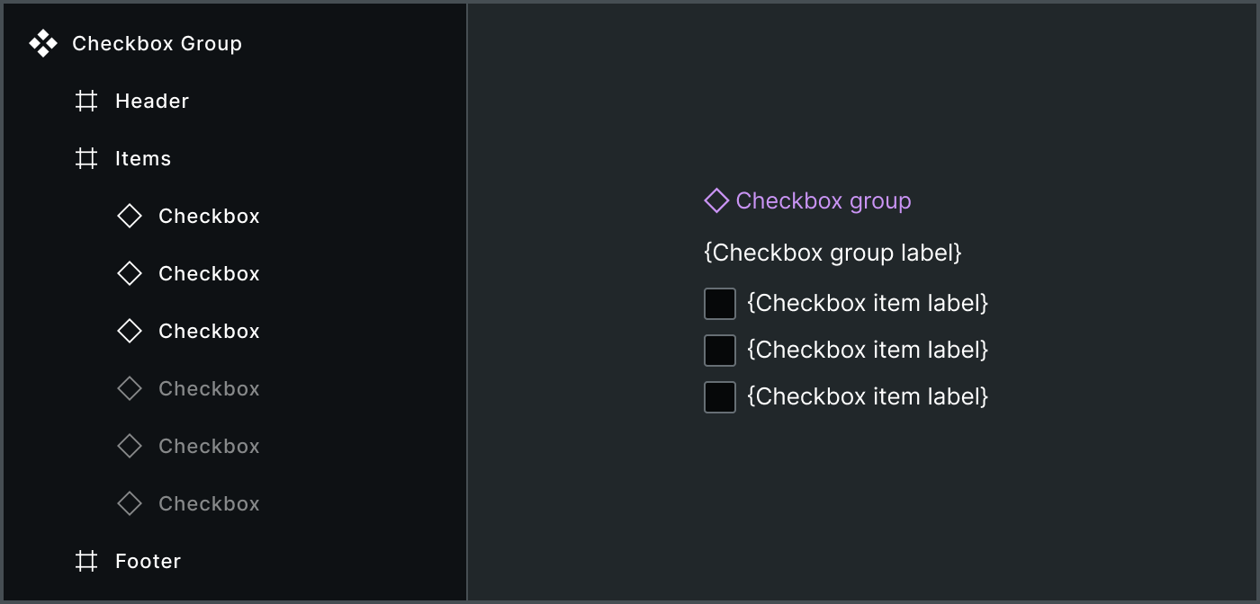
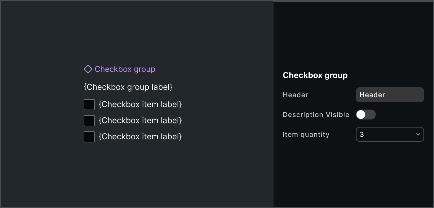
Checkbox Group instance with an items slotFor example, include an items slot in a checkboxGroup with three checkbox instances by default. It’s easy for the user to add, remove, reorder and even quick drag to create a longer list of items.
Pros
Improved Composability: Slots solve the primary problem: a clean container-child relationship to easily add, remove, and reorder items.
Low Asset Complexity: This eliminates the need for workarounds like “hidden layers” and “count props,” which improves file performance and reduces implicit conventions.
Clear API: An items slot is an explicit, native way to define the types and constraints of customizable children.
Cons
Open, Uncontrolled Children: Figma slots are inherently open. They’ll take anything, no matter what you designate as “preferred.” Therefore, systems must trust users and implement methods to verify design and code.
Risk of Empty Slots: The user can remove all default items, causing the slot to appear empty.
More Complicated Definition: Systems must define a more granular slot architecture including naming, constraints and guidance.
You could also assert it requires a learning curve. I wouldn’t agree. All the previous methods were both error prone and harder to use. The simplicity of starting with a composable area with items you need drastically saves time and is directly the interaction users prefer.
Architecture
When adding native slots to library components for repeating patterns, be mindful of details like naming the prop and layer, default content, minimum and maximum quantity, and permitted values.
Naming
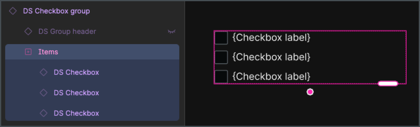
In Figma, slots are both a property type (SLOT) and layer type (SlotNode). The names of each are revealed in the Props and Layers panels, respectively. Choosing a conventional name for both improves user understanding and expectations when composing repeating items across a library.
Favor items (purposeful) over children generic). During our refactor to native slots, we narrowed down to considering items versus children, where children had already been chosen generic component slots with no default content. We chose items to carry a narrower purpose that expects specific types of children.
Distinguish items and children. In addition, components with items often have additional elements not included in the slot, such as an avatarGroup’s end count or a checkboxGroup’s header and error message. This, too, distinguishes the repeating items case from corresponding to “all of a component’s children.”
components:
  checkboxGroup:
    elements:
      items:
      header:
      description:
      validation:
    default:
      layout:
        - root
          - headerArea
            - header
            - description
          - items
          - error
            - errorIcon
            - errorMessage
Default items
Generally, three items seems the reasonable convention for most item sets, since three:
Affords that it’s an indeterminate list more strongly than two or one
Enables distinguishing a
selecteditem (often the first item) separately from other items in components liketabsandradioButtonGroup.
However, there are cases where two (such as actions in an alert) or other counts make more sense. We’ll document when to diverge from the convention.
Additionally, it’s important to not confuse default slot data with ready-made examples. Sure, a checkboxGroup can have many, many items, and you can depict that in your system’s set of examples. However, that’d prove a very hostile default relative to the far more frequent cases of a few items.
Minimum and maximum item quantity
Unlike generic slots which can be empty, slots for repeating items generally require one or more items. As a result, we’ll define such slots as minItems:1.
Occasionally, an items slot may govern a maximum number of items. For example, an Avatar group may include up to four Avatar components, after which a count to the right of the last item.
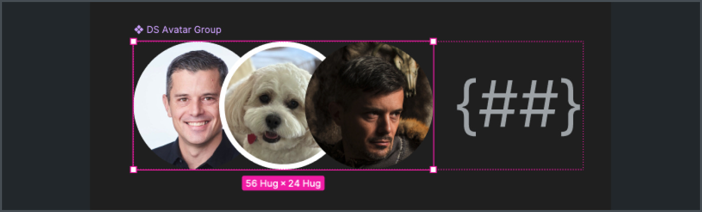
avatarGroup instance with a slotIf a system chose to include this hard constraint, the avatarGroup would define an items slot as:
components:
  avatarGroup:
    props:
      items:
        type: slot
        anyOf: avatar
        minItems: 1
        maxItems: 4
Permitted vs preferred values
Figma’s slot preferred values match the experience for instance swapping. Undoubtedly, slot properties should associate the single item type (like checkbox within checkboxGroup) as preferred values.

avatarGroup with avatar defined as a preferred valueNevertheless, Figma’s slots are open to accept any child and cannot be formally governed. This relationship is stricter. In specification data, this is represented by a list anyOf items, like:
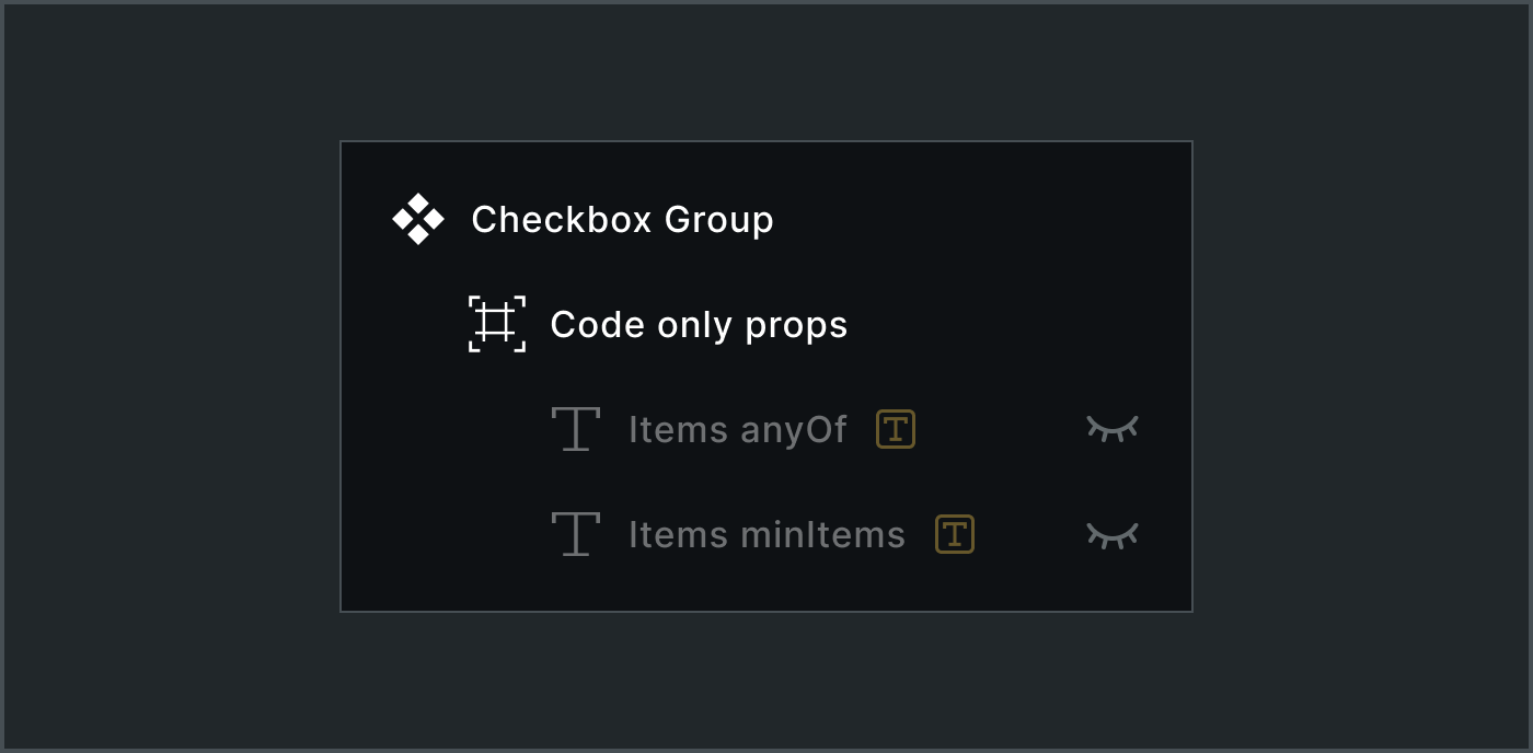
components:
  checkboxGroup:
    props:
      items:
        type: slot
        anyOf: checkbox
        minItems: 1
We’ll use code only props to identify what items are permitted, minimums and maximums so as to handoff the intent via component data downstream to collaborators and machines.
Figma’s native slots are the new primitive that shifts the burden of complexity from the designer's canvas back to the system’s architecture. By providing an explicit, consistent API for repeating items, systems can move post brittle hacks and offer a cleaner canvas, a simpler property panel, and a more flexible library for everyone.