"Code Only" Props in Figma
Expanding component API shape in design assets


I’m among those that steward cohesive component API. In designing systems, it’s our job to define and communicate accessibility, behavior and non-visual logic just as much as style and layout.
As we define components, we’ll face intricate questions that shape how components work. Figma hasn’t yet been the place to express all those answers. Yet, what if… we started shaping more of that via props to Figma assets?
This post details a technique for adding “code only props” to Figma components. It covers how these props better connect system designers with their users and system developer counterparts, how to build them into Figma, and ends with examples from simple to controversial to gloriously yet dizzyingly complicated.
Challenges
My work often focuses on a core component library that is built into Figma assets, transformed into spec data and is implemented across iOS, Android, and the web.
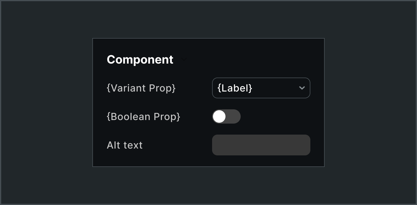
Each component’s property shape can be complicated. Figma provides for many prop types: text (primarily for text characters), variant, boolean (for visibility), instance swap and soon slot too. Yet, Figma prop types are nowhere near comprehensive and bias heavily towards visual outcomes rather than broader concerns.
This challenges system designers, who want to:
Specify non-visual accessibility and other configurations as a part of defining a system component
Maximize API they can shape and deliver into deterministic, automated processes
Expose non-visual props that product designers can use to express an intent
Clarify relationships of visual and non-visual props
Improve how Figma synchronizes with code libraries and other assets
Solution
We began to add Figma TEXT and props and VARIANT props of nested instances that correspond to additional props, housed in a practically hidden “Code only props” layer.
Step 1. Code-only props layer
Add a Code only props layer as a child of the component’s root layer, positioned at (0,0) with width and height of 0.01 and clipping contents.
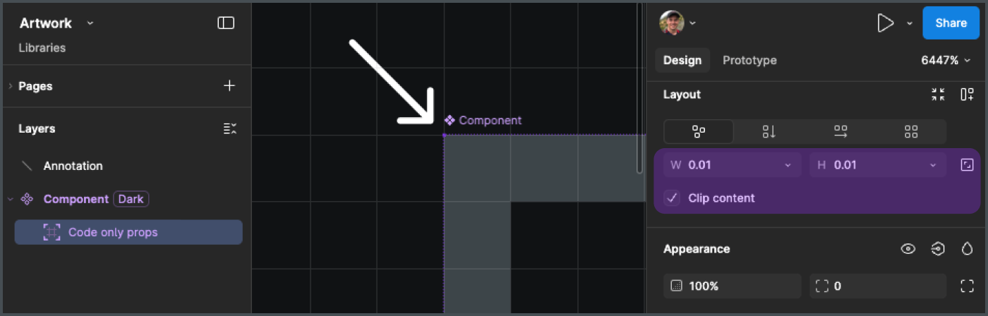
This virtually hidden layer contains semantically-relevant layers bound to component props that are nonetheless hidden from the visual experience.
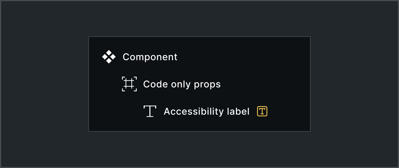
Step 2: Nest a layer per prop
Add text and nested instance layers corresponding to each prop.
For example, interactive components like button, link, checkbox and breadcrumbs can include an Accessibility label prop. This property often maps to an internal label like aria-label or an associated <label> tag.
A system designer could bind an Accessibility label property to an Accessibility label text layer within the code only props frame.
A product designer will then see the prop in the Props panel.
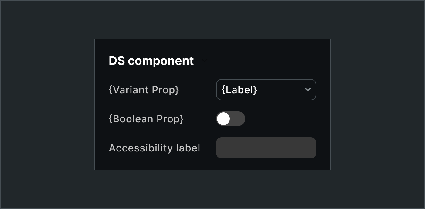
In general, the text layer is left visible or hidden (thus suppressing the field from view) depending on whether it’s relevant to a product designer.
Step 3: Integrate into handoff and automations
Handoffs and tools (like generating specification data from assets via tools like my Anova plugin) pick up the prop, adding accessibilityLabel to the versioned contract centrally leveraged to implement and maintain a component across platforms.
components:
  {component name}:
    props:
      ...
      accessibilityLabel:
        type: string
As Figma data is transformed, tools can:
Infer types based on default values, such as a string (
Label), number (0) or enumerated list (such ash1|h2|h3|h4|…), although be careful with thatOmit the Figma structure irrelevant to generated code, since the code only props layer and its children are metadata, not formal component layout
Add and bind these layers when generating Figma assets from spec data
Tradeoffs
Sure, props like accessibilityLabel, headingRole, and maxRows are less important to designers exploring design concepts. Tradeoffs include:
✅ Improves visibility of component props to product designers
✅ Enables system designers to shape more of the component API
❌ Complicates Figma assets
❌ Adds friction when defining component due to unclear boundaries on which props to include and how to name them (in my opinion, this is productive friction)
Additional Examples
Image src and altText
If building for one platform or even a content management system, it may or may not be valuable for a product designer to specify an altText or src but it could still be relevant for a system designer to convey one or both expected props to a system developer or a pipeline.
To accomplish this, a system designer add both text layers, bind each to a component prop, and hide those irrelevant to product designer activities by hiding the text layer(s).
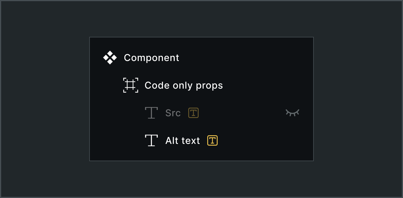
The product designer would then only see the props they need to, such as only the altText prop.
altText propSpec data would predictably encode both props:
components:
  image:
    props:
      ...
      src:
        type: string
      altText:
        type: string
Now, there are reasons we’d avoid these props in many systems, such as (1) not needing to because they are default HTML attributes or (2) it’s platform specific, running counter to the broader goal of orchestration across platforms. Nevertheless, the example reflects the flexibility of exposing and hiding props.
Heading Semantic Tag and Level
For a prop used to set which HTML tag is rendered in the DOM, the Heading component Figma asset could include a nested instance of an as component with variants for h1|h2|h3|… and so on. While it feels odd to create such utility assets in Figma, it’s actually simple and quick.
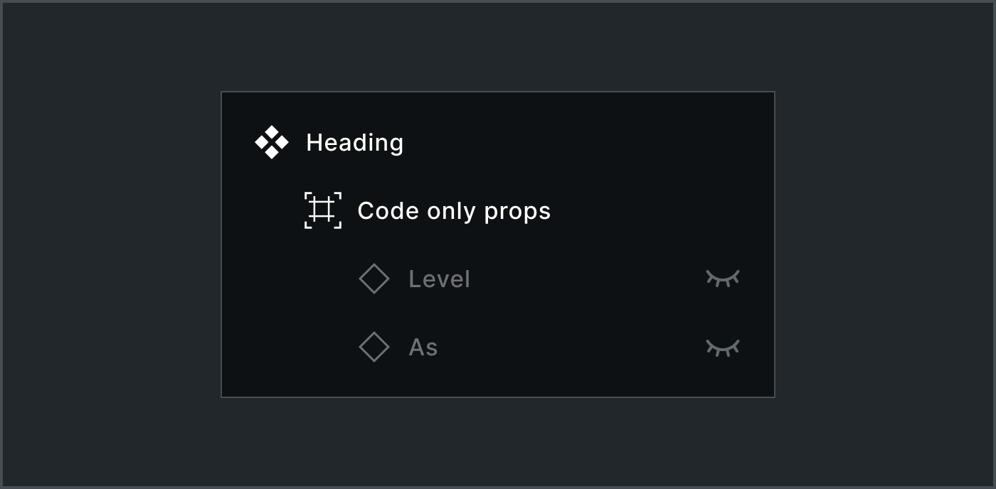
As and Level, both hidden from the product designerThe instance with one variant prop then gets transformed into spec data alongside related props like level:
components:
  heading:
    props:
      ...
      as:
        type: string
        enum:
          - h1
          - h2
          - h3
          - h4
        default: h1
        nullable: false
      level:
        enum:
          - 1
          - 2
          - 3
          - 4
          - 5
        default: 1
        nullable: false
In code, this would be used as:
<Heading as=”h3” level=”2”>My Title</Heading>For teams working across platforms, they’d need to decide whether or not specification data captures platform-specific props like these and whether or not those sync with Figma assets. That said, decades of experience suggests that conversations of separating concerns of as (structure) and level (presentation) aren’t dead yet..
Slot Properties
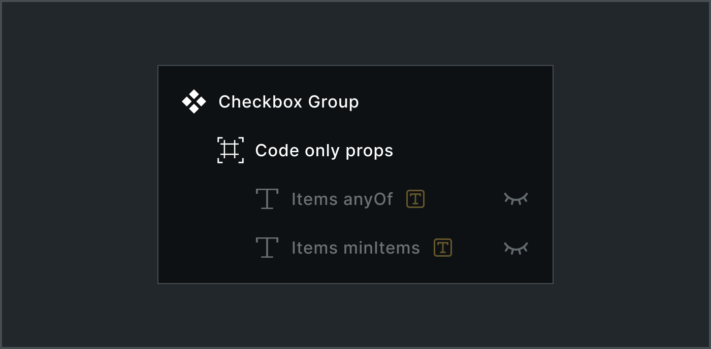
As we migrate to native slots in Figma, we’re adding additional props to describe slot configurations like anyOf (permitted children), minItems and maxItems.
For the Checkbox Group, we’d expect at least one child and they’d only ever be a Checkbox. Therefore, we build our asset to include:
The
itemsslot propThe
items anyOfthat includes a comma separated list of component names (in this case, set to simplyCheckbox)The
items minItemsprop, here set to1
Both props are hidden from view for the product designer.
This corresponds to spec data of the shape:
components:
  checkboxGroup:
    props:
      ...
      items:
        type: array
        anyOf:
          - checkbox
        minItems: 1
We considered other options in Figma. The emerging slot prop type may include a description field. However, a description is a rich text, less stable and unstructured target for automated tools. If we were to leverage it, we’d use it for guidance, not specs. The already supported .preferredValues field is much closer in intent, but we chose to not overload it with what’s permitted values. More on that another time.
Text Area
In more complicated components, a system designer must consider what may become a dizzying array of logical relationships.
Textarea could include configurations like minimum value length, maximum value length, showing or hiding a max character count and whether that includes current character count. Not all these props reveal themselves visibly to the user.
For example, a minLength property could be enforced through a component behavior but not within a Figma asset. minLength could also be related to – but doesn’t trigger – a validation represented by Figma variant with an error message. As a result, minLength is a viable code only prop.
Textarea height might be bound by a minRows count (such as 2 by default) and a maxRows count (possibly undefined by default). In Figma, product designers simulate that by resizing and fixing asset height to fit their use case. Yet, system designers could imbue this intent via code only props.
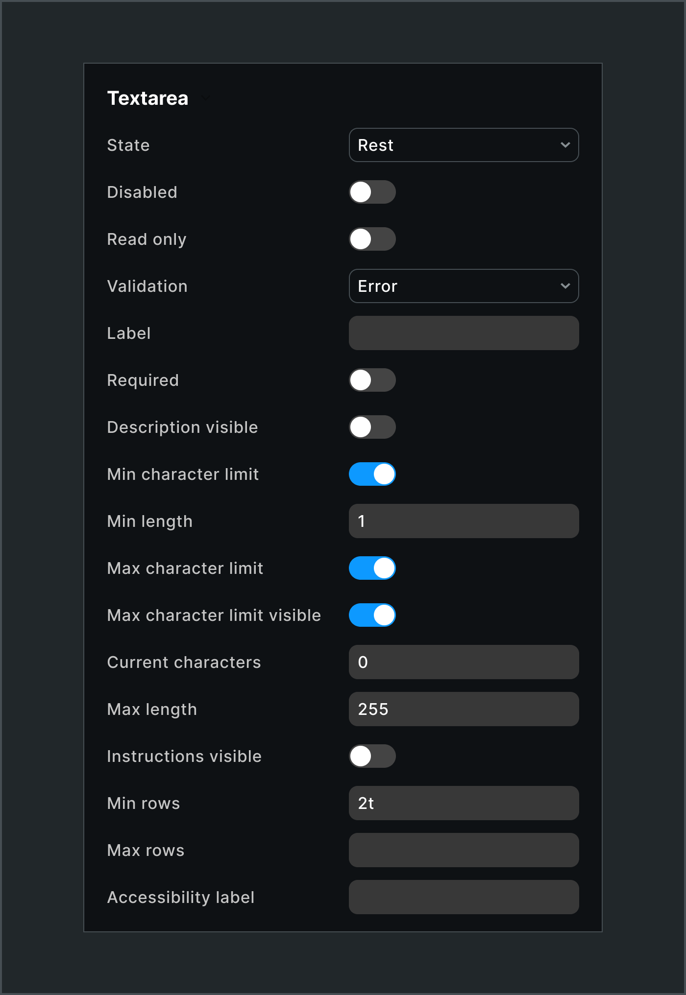
These logical relationships result many text and boolean. All are built into the asset, enable logical relationships to show and hide relevant layers, and convey to spec data. Yeah, this one’s a doozy. Yet by the end of this modeling exercise, we’d learned much more about the component’s intricate behaviors.
Using “Code-Only Props” in Figma—it’s a bit of a technical trick using hidden layers to sneak data through—lets Figma be an origin of truth defining a component. It’s behind-the-scenes stuff, for sure. System designers should handle complicated requirements without making the product designer’s prop panel a mess.
Thank you for your insights and foundational work throughout your career. I am stepping out of my comfort zone to ask you a question.
Having A11y is great. From my experience, developers and even some design peers in the past would overlook this.
How feasible is this technique for the long-term maintenance of the complete components?