Slots in Design Systems
Improving flexibility through custom composition inside components

No system solves every problem we’ll ever face. Nor should we want it to. Instead, a well-architected system balances what’s fixed and what’s open, where you are constrained by guardrails and where you can – and should – innovate.
Insert slots.
Slots define the areas in a component to vary content and structure, adapt layout, and improvise new ideas. Adding flexible, customizable areas to components move systems away from rigid, frustrating boundaries designers and developers struggle with today. Emerging native support of slots in Figma should usher in a next generation of component libraries, enabling more customization we crave without sacrificing control and consistency systems promise.
This post introduces the concept of slots in UI components. First, we’ll define slots and demonstrate the many forms slots take across common, familiar components. From there, we’ll dive into considerations of slot types, properties, subcomponent parts, and ready-made examples we’ll curate. Ultimately, slots present an array of new architectural challenges we’ll face and resolve in the year(s) ahead.
Getting Started
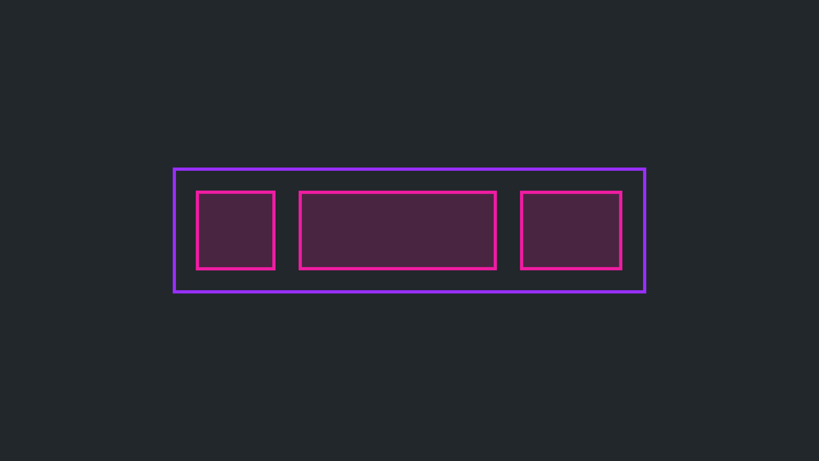
A slot is a designated place inside a component where custom content can be inserted—an intentional opening in a component’s hierarchy to allow custom variation.
In Figma, a slot are presented as a layer bordered in pink that acts a frame inside a component instance. Inside that boundary, you compose whatever you want.
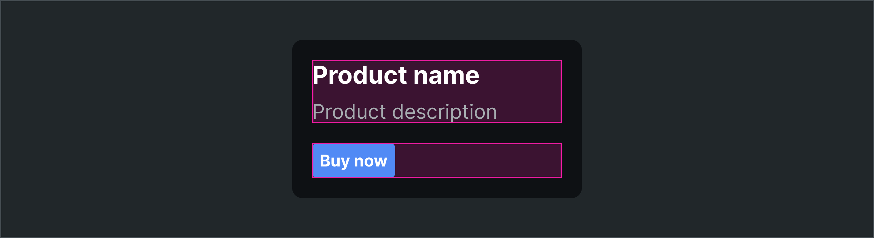
In code, slots present as mechanisms like children (what’s included within the component’s tags) and tags and props like footer in the example below. Different platforms (like iOS and Android) and frameworks (like React, Web Components and Vue) use different syntax to accomplish the same goals.
<Card footer={<Button variant="primary">Buy now</Button>}>
  <h2>Product name</h2>
  <p>Product description</p>
</Card>
Slots make components composable and adaptable, providing a predictable way to customize content while preserving control of the component’s surrounding layout, styling, and behavior. Common needs can remain configurable, yet uncommon challenges can then be solved through composition.
Yet, slots blur component boundaries. Without slots, what’s inside a component is encapsulated, unyielding beyond what you configure using props. With slots, what’s inside can include a customized design. Teams become empowered to shape what they need, and systems continue to constrain what stays consistent.
Slots also improve alignment of design structure to how code works. Component hierarchies in React, Web Components, and native libraries are likely already quite composable. Adding component slots in design tools isn’t just a boon for creativity, it improves clarity and alignment during handoff and implementation, too.
Usage
Slots can impact more components across an ecosystem than one might expect. Sure, slots apply to moderately sized components that need customization. However, they can also apply to smaller “core” components as well as layout up through layers of composition including the page.
General slots
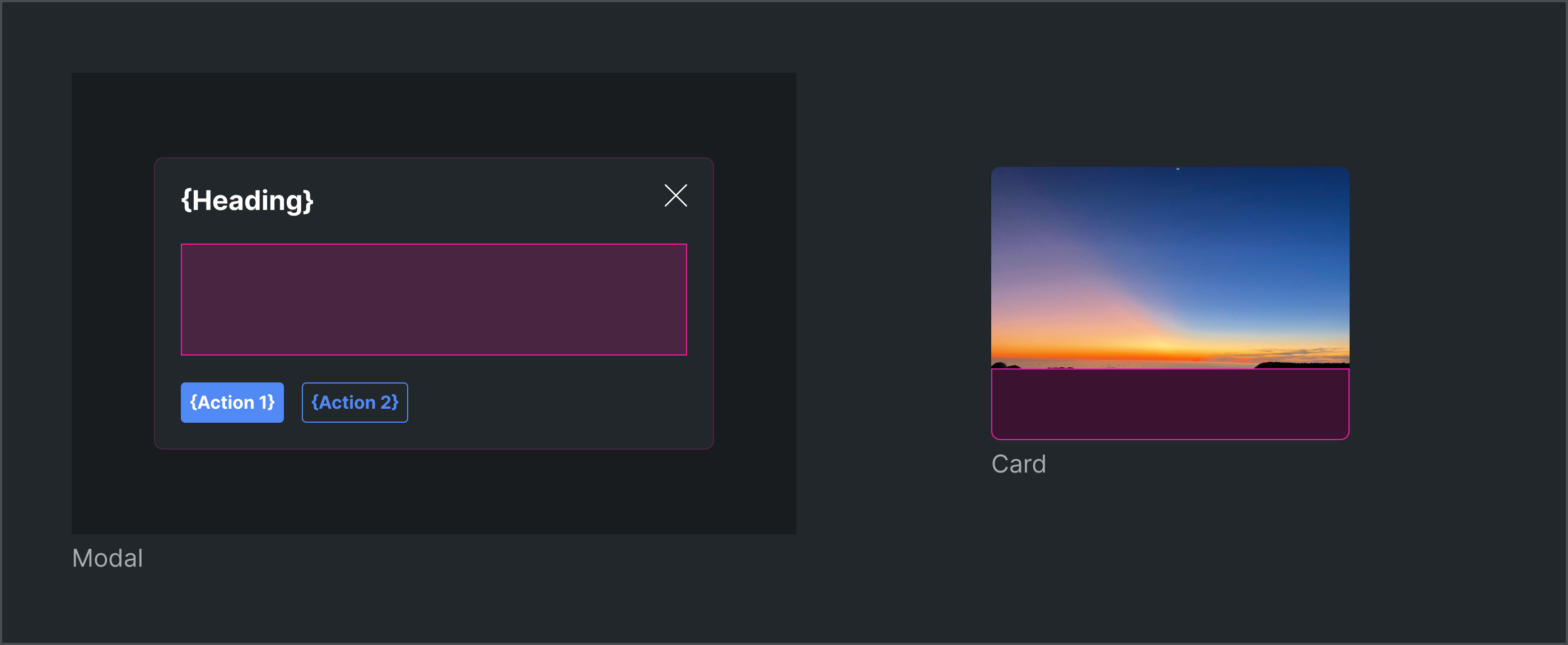
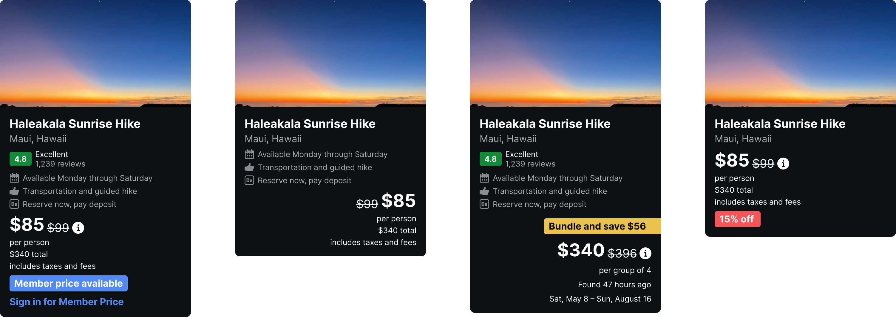
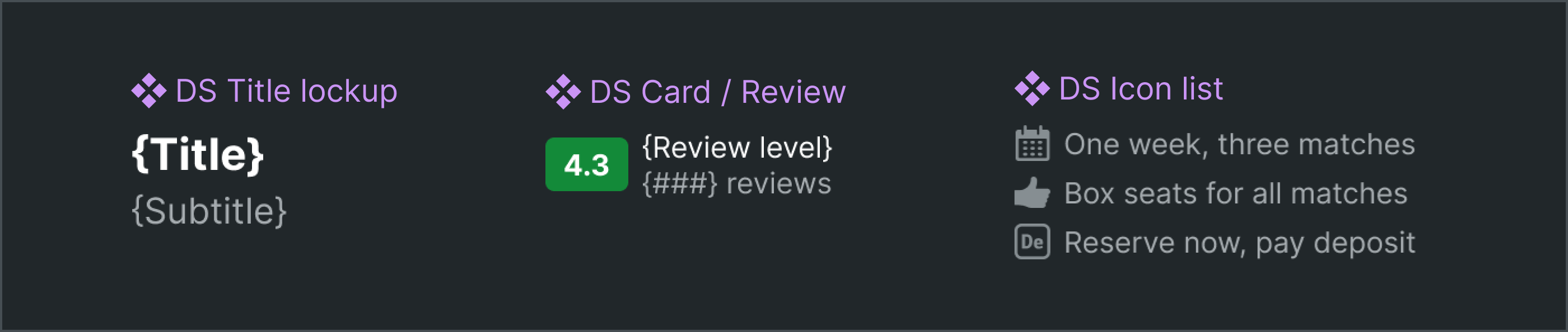
Slots are most recognizable and expected in components like Modal and Card for which users already expect to compose content and structure inside. These are examples of general slots for the component’s main body, and typically corresponds the component code’s children.
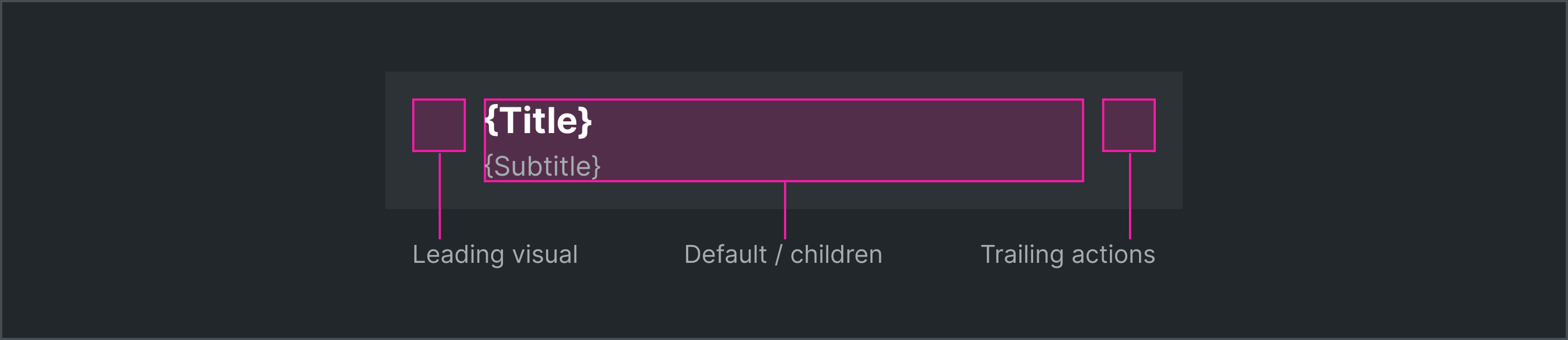
Named slots
Components name slots for multiple composable areas. For example, subtle shifts in content, styling, interactivity and layout abound in each area of a Row component seen stacked in feeds. Supporting each unique display as a configuration isn’t just impractical, it’s avoidable brittleness.
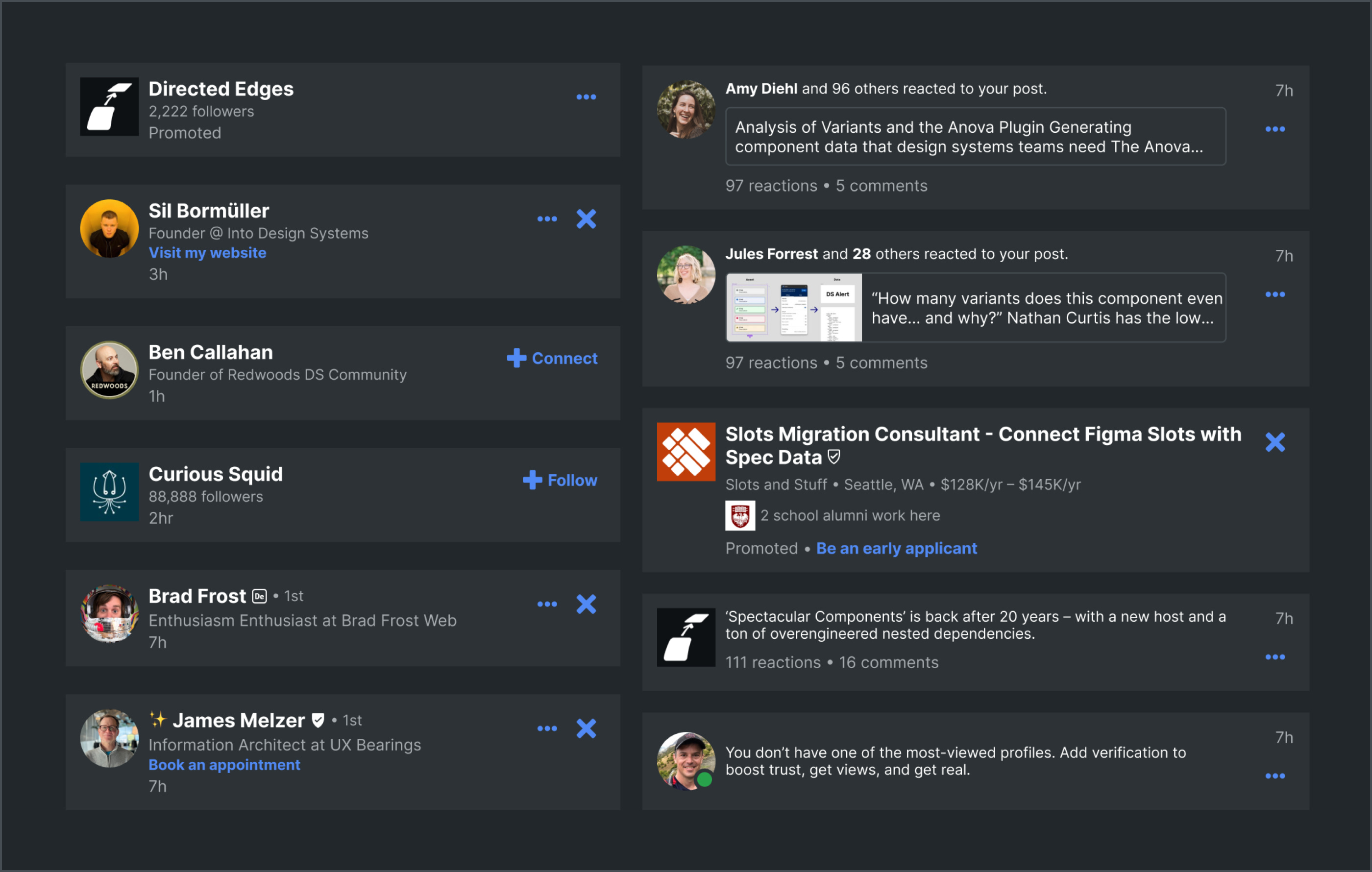
Instead, the Row warrants named slots. This three-part layout could enable customizing independent areas: the leading visual on the left, the text in the middle (possibly as the general slot), and the trailing actions on the right.
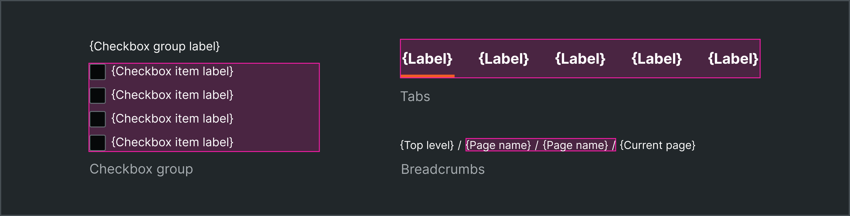
Slots for groups of repeating items
Slots also improve our ability to encode nested yet flexible relationships. These are evident in group/item components like Checkbox Group, Tabs, Breadcrumbs and even Buttons. In each case, slots provide the space for an indeterminate quantity of a single, predictable type of children.
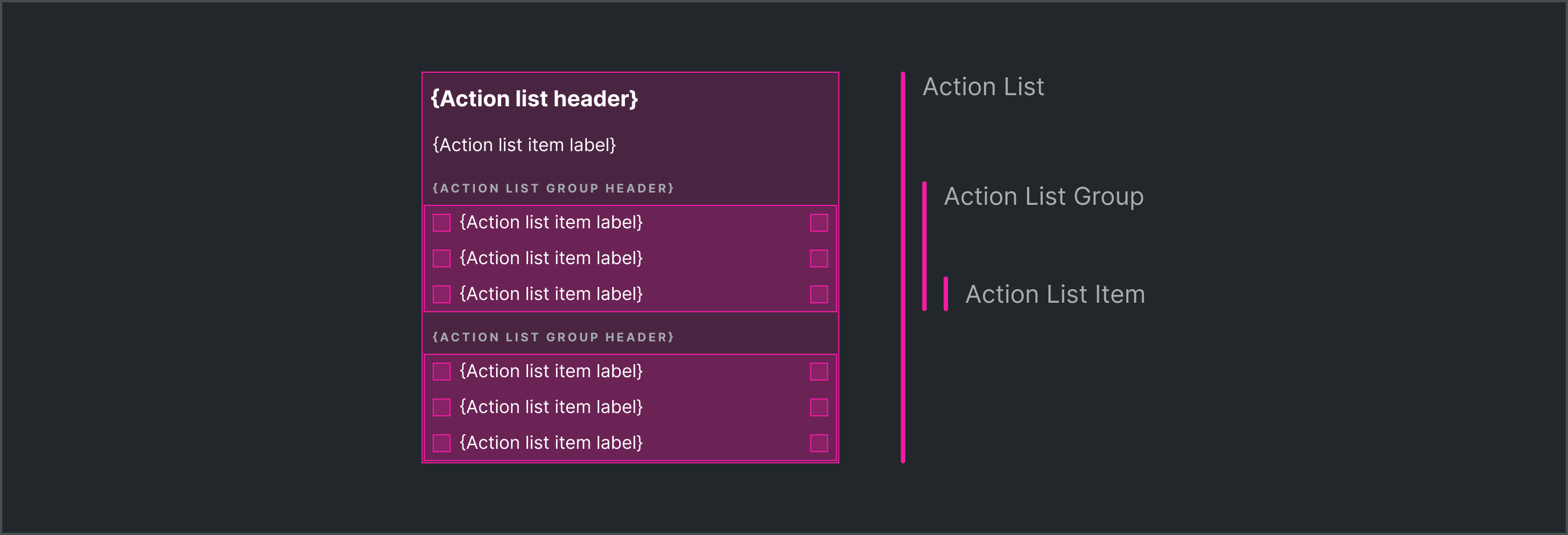
Nested slots
Nested slot relationships can span more than two levels. An Action List group could nest specific Headers and Items, and even Group those items each with a Group Header too. Each item could warrant slots for their leading and trailing visuals. Slots are everywhere, serving levels of nested composition.
Slots for higher-order layout
Slots can apply conceptually upward through layers of reusable components to compose an entire page. You could nest a Checkbox Group in an Accordion slot. You could stack Accordions in the left column slot of a reusable Page row layout component. You could assemble multiple Page Rows in a reusable Product Category layout pattern.
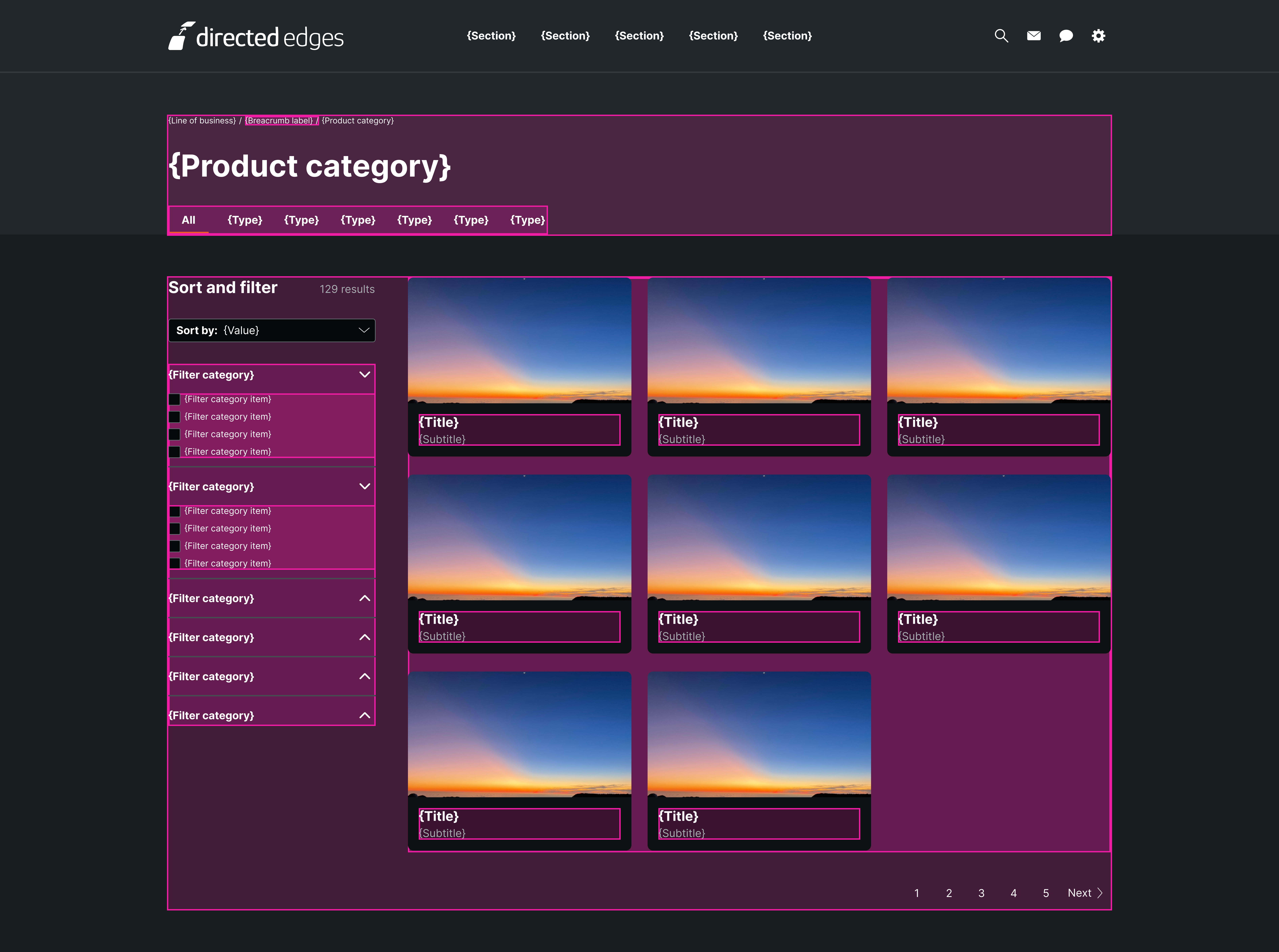
That layout hat pattern, or layout component, or increasingly smaller and customized layouts and components could be included in the Body slot of a Page component. Components with slots from the Page down afford an opportunity to position layout rules, structure, and visual styling at many reusable, independently managed levels.
Time to say goodbye to countless designers detaching instances and putting in tremendous solo efforts to scaffold, build and maintain higher-order layout.
Architecture
Properties
Architecting slots in a UI component includes specifying properties like:
Name, for both general “
default” slots flowingchildrenas well as specific, named slots in areas likeheader,footer,actionsorleading visualsDescription, whether guidance displayed to component users and/or spec data formalizing other properties
Default value that can be a single nested instance or a deep, complicated composition to serve as a starting point and possible fallback
Preferred or permitted children by both type and quantity, such as only Checkbox Items in a Checkbox Group’s slot but any quantity you need
Layout, such as how slot contents arrange themselves in direction, item spacing and padding relative to the containing component
Subcomponent Parts
An increase in component slots and custom compositions within them could lead to a decrease in the need for configurable properties and a rise of more modular yet simpler subcomponents.
Breaking down larger components into subcomponent parts is challenging. What level(s) are better as smaller modules? At which level does each remaining configuration belong? What happens when bigger things still need to control the smaller things inside?
A Card may have reusable Title Lockup and card-specific Reviews module. It’ll be up the component user to arrange these flexible, smaller parts instead of configuring so many properties that resulted in the brittle supercomponents pursued in the past.
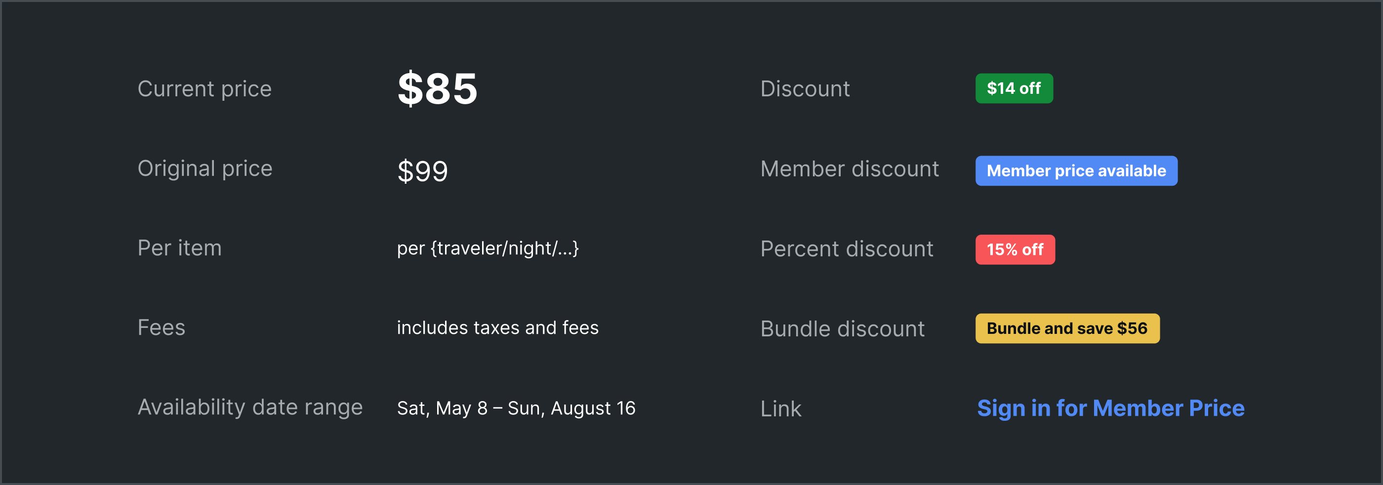
For a Product Card, this could mean any array of typical nested instances used in particular ways (like how to communicate discounts using a Badge) as well as primitives with conventional visual styling (like an original price, struck through).
Ready-Made Examples
Equally challenging is how to equip designers and developers to put pieces together faster. With greater composition comes the need for more examples. Not just pictures, but the actual parts in ready-made examples that both express what’s possible and easily get you most of the way there.
Systems must manage examples as an additional output to enable efficiency and experimentation. Ready-made examples are neither guidance docs nor component assets; instead, these scaffolded starting points represent a distinct deliverable of both designers and developers.
Key Challenges
Slots architected well and used effectively will improve flexibility, empower designers, and significantly accelerate efficiency. Slots done wrong carry consequences: undermined consistency, avoidable work, component fragmentation, design and code debt. Thoughtful design systems must carefully add slots so as to not break the promise of a consistent, high-quality and efficiently produced experience.
Adding slots throughout a catalog raises questions per component like:
Depth: How low should a slot go in the component’s hierarchy of layers/nodes?
Quantity: How many slots should a component have? Just a single general slot, or many named slots, or… both?
Code Alignment: How strictly should slot depth, quantity and naming match between Figma and code libraries in web, iOS and Android?
Layout: How difficult will designers find it to create intricate layout inside slots and hand off those details to developers?
Styling: How much do you style a slot and what goes inside it by wrapping it, directly setting properties of it, and/or providing inherited theming into it?
Permissiveness: How constrained should slots be in what and how much they include? Can they open up gradually over time without breaking how it works?
Slots will ask more of today’s designers and developers.
Over the past decade, design systems accelerated more designers with less interface design skills to create better experiences more quickly. This enablement is in no small part due to the expansion of consistent, well crafted libraries of configurable components. Insert a component, configure its properties, arranged in a broader view to solve a problem.
Today, system users need more than props. They demand control and flexibility. That the predominant design tool of the moment – Figma – will natively support slots will push our systems towards that flexibility towards composition inside components. Ready, set, go!
Excellent article Nathan, thanks for your clear overview!
This hit, Nathan.
Slots feel like finally admitting real product work is messy. We need space to improvise. Code’s been composable forever. Design tools are just now catching up.
But freedom needs discipline. Clear purpose. Depth rules. Examples. Otherwise it’s just chaos in a prettier frame.