
I scanned at the React prototyping kit the team made. It was rounding out the catalog, made to order for a design org eager to prototype with LLMs. Design orgs can be unwilling to wait for production-grade code from engineering that is months or quarters away. This kit is useful right now. Prototype-ready code, in the hands of designers acclimating to expressing design with LLMs, is what design leaders are clamoring for.
Yet, I was a bit puzzled. The design technologists spent weeks coding components one at a time, leveraging agents and LLMs, MCPs and my specs tooling. They were doing the good work, grinding away. But the effort was consuming time and capacity. The code was already adrift from design in Figma. The components weren’t quite fitting together. They powered through, anyway, buoyed by the evident value. But the code was so predictable, even generable. I kept wondering, can’t this be automated? Yes, it can, to as little as a few seconds using specs.
I set out to prove a legit prototyping kit can be generated from expressive specs, via a mini-code factory build from the same moves I see engineering teams making. I wasn’t aiming for prototype-grade, yet I ended up beyond that, expressing far more. Turns out Figma assets can carry cheaply authored behavior and accessibility data that pays big downstream dividends.
This post describes that journey: why I started and what I learned, what code is generated, how components fit together cohesively, and how it pushed specs authoring and conventions further in Figma.
Why generate code?
A few reasons, not all equal. While prototyping-grade assets motivated me, I think I ended up valuing the demo of a code factory and hardening specs more.
Goal 1: Instantly generate code for designers to use in code prototypes
My clients are spending considerable capacity building and maintaining prototyping kits used by designers in Cursor, VS code and similar tools. Those kits largely deliver “Components with an api and visual expression faithful to Figma and spec’s transformation of each.” That’s a much lower ceiling than production grade.
Heck, I can script that - no model is needed to produce the kit. So I did. What designers do with it in Cursor is their business; the kit no longer costs tokens to exist.
Goal 2: Demo a code factory that scripts a (re)generable baseline
“Good enough to prototype with” is the stated goal. “Good enough to scaffold production code” is a flattery I’d accept but don’t seek.
Yet, specs serve as a component contract on which production code is built. Specs data is broad, deep, and predictable. As a result, engineers I work with consume specs into a code factory to script most of the code contracts, style sheets and scaffolds up front. From there, it’s a combination of agents and/or humans polishing to take the component to become a hardened, production-grade asset. Specs’ react and webcomponents illustrate that factory’s first stage.
Goal 3: Harden and expand specs by building and testing myself
An emitter generating code can’t ask me what I meant halfway through, so gaps surfaced rather than getting papered over. Everything in my head – undocumented conventions, schema property relationships, the library graph – showed up as vague, missing or misinterpreted. Turns out my own memory was acting as part of the schema format. Generating code moved that memory into the format and the logic.
About the generated code
I’ve extended the specs toolkit to emit code a good ways there. With generated specs in hand, the followup command is simple: specs react and specs webcomponents. I’ll focus the remainder of this article on React, just as I did to reach this experimental maturity. React output includes:
react/
├── src/
│   ├── _runtime.ts
│   └── components/
│       └── <component name>/
│           ├── scaffold.tsx
│           ├── contract.ts
│           ├── styles.css
│           ├── stories.tsx
│           └── <subcomponent name>/
|               ├── scaffold.tsx
│               ├── contract.ts
│               ├── metadata.ts
│               ├── styles.css
│               └── stories.tsx
└── …
Every component (and related subcomponents) are published to a folder, including:
scaffold.tsxfor React /scaffold.tsfor webcomponents as the renderable component. Should an engineer or agent look to extend what’s generated, they’d duplicate and evolve it from here.contract.ts, the component’s typed surface: one enum per multi-value prop, an interface that uses them, and a defaults constant.styles.css, including CSS for default and variant configurations and sensitive to state machine, invalid prop combinations.stories.tsx, ready for display in storybook including variants, ready-made examples and a sticker sheet.
Web components generation also may layer additional files like api.ts, metadata.ts, host.css and light.css for its distinct concerns.
How generated code fits together
Expanded foundations
The specs environment already extracts icons as SVGs via fetch and images referenced by components and examples via generate of the specs themselves. In addition, library-wide tokens are added as cssvars.css and modes. Building code generators usefully drove consolidating everything into an assets/ folder that also may require non-system fonts provided by the user.
assets/
└── icons/          SVGs already output by `fetch` command
└── images/         PNGs already output by `generate` command
└── fonts/          Provided by the user
└── cssvars/
    ├── cssvars.css NEW, output by `react` command
    └── modes.json  NEW, output by `react` command
Set up with Storybook
Equipped with generated code, setting up Storybook was a quick agent pass that enabled each component’s stories to come to life.
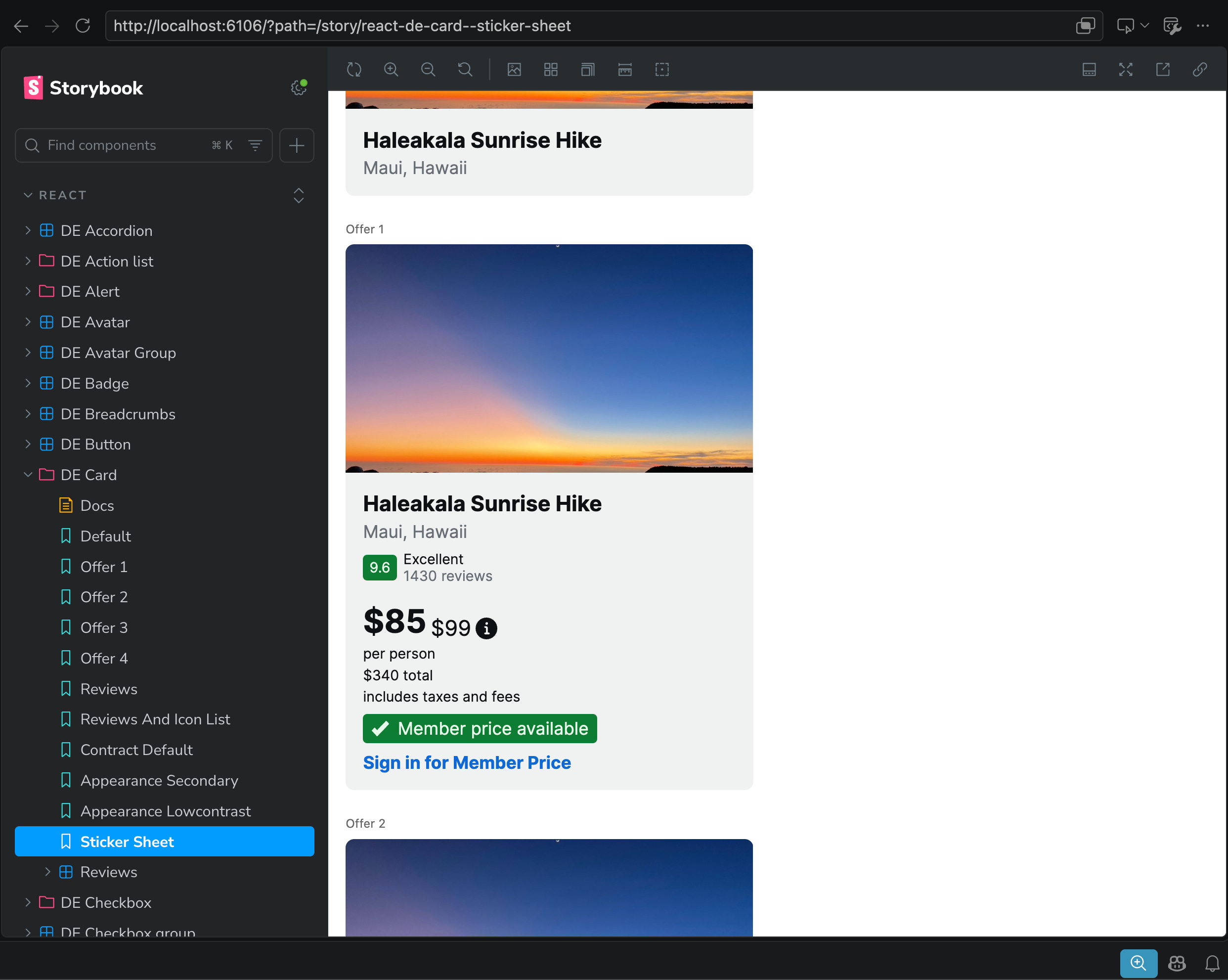
Stories emerged for component variants, ready-made examples and sticker sheets across the catalog. Confidence great with each composition like Card above, which visually confirmed so many interdependent concerns coming together:
Foundations of images, icons and fonts woven through
Primitives of containers (Figma frames), text and glyphs styled with content
Nested components properly configuring, like a
Badgewith icon, content and appearanceLayouts arranging and spacing primitives and nested instances within slots and across compositions
Slot and pattern composing well to n-levels of depth
Testing and refining output
Equipped with code producing solid visual results, I evaluated how each story held visually true against Figma assets. I extracted images using Figma MCP from two client and two demo Figma libraries and compared each to its corresponding story.
Each library had it’s own conventions, design expressions, and quirks. I set up a trio of QA skills to drive work by library and component: /transform-qa-start, /transform-qa-fix loops and /transform-qa-end. Each code part – scaffold, contract, css styling, and so on – gradually grew more complicated yet smoothed as defects were detected, prioritized and retired.
Fit the code to the contract, not the catalog.
My goal for specs (broadly) and React / Web components (specifically): generalize across any library, not tune to one library’s quirks until it hits zero failures. As I iterated, one principle governed every fix: contract, not catalog. The generator keys off what a spec declares, not any library’s unique conventions.
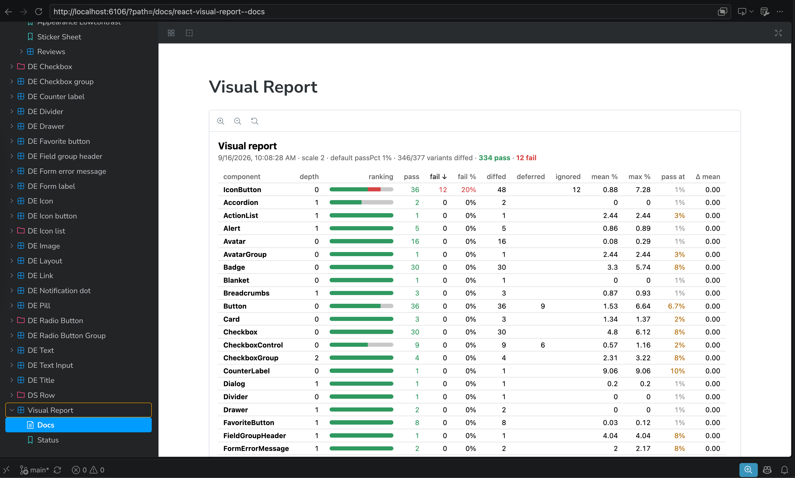
So each library served as a burndown, not a rebuild. Reports like the one above, captured near the end, drove fixes until a library ran green. The last library, with 30 components, triggered an hour of polishing. Future libraries may cost less and less.
How specs improved
Visual and API fidelity between React and Figma was a primary goal and not a surprise. Once I got there, I immediately wanted more. Behavior and accessibility were obvious candidates. Additionally, primitive elements with overridden styles read as off-system in compositions that should reflect configured system components.
Such challenges aren’t necessarily expected of prototyping kits or demos, but solutions felt within reach. Each challenge led to expanding specs with low effort, high reward concepts.
States
Specs now supports a mapping of Figma props and enums (like state:rest|hover|pressed) to concepts conveyed across a library through to generated code.
states:
  hover:
    prop: state
    value: hover
  active:
    prop: state
    value: pressed
  disabled:
    prop: isDisabled
That way, if designs architect state-related props in their own conventions (“We use isDisabled”), translation is explicit and direct. Equipped with concepts, code can generate proper styling, including interactions between concepts.
/* Variant: state=Hover */
.de-pill:hover:not(:disabled):not([aria-disabled=”true”]) {
  background: var(--de-color-action-hover);
}

/* Variant: state=Hover — label */
.de-pill:hover:not(:disabled):not([aria-disabled=”true”]) .de-pill__label {
  color: var(--de-color-text-primary-inverse);
}
For more on states, read the states setting docs.
Roles
Many atomic components comprising the majority of a core library include behaviors and accessibility features following established patterns. As a result, specs is experimenting with assigning roles, a concept that emerges from a combination of WCAG, code and how systems package a composite of intents into a single contract.
A role declares the interaction semantic of an anatomy element — this element is the button, is the checkbox control, is the label for that control. Without roles, transforms emit visually correct but behaviorally inert markup: a button scaffolds as a <div> that cannot be focused or clicked through the contract, and a checkbox has no <input> to check. With a role, each transform deterministically emits the platform’s native control, the accessibility wiring between elements, and the event handlers in the generated contract.
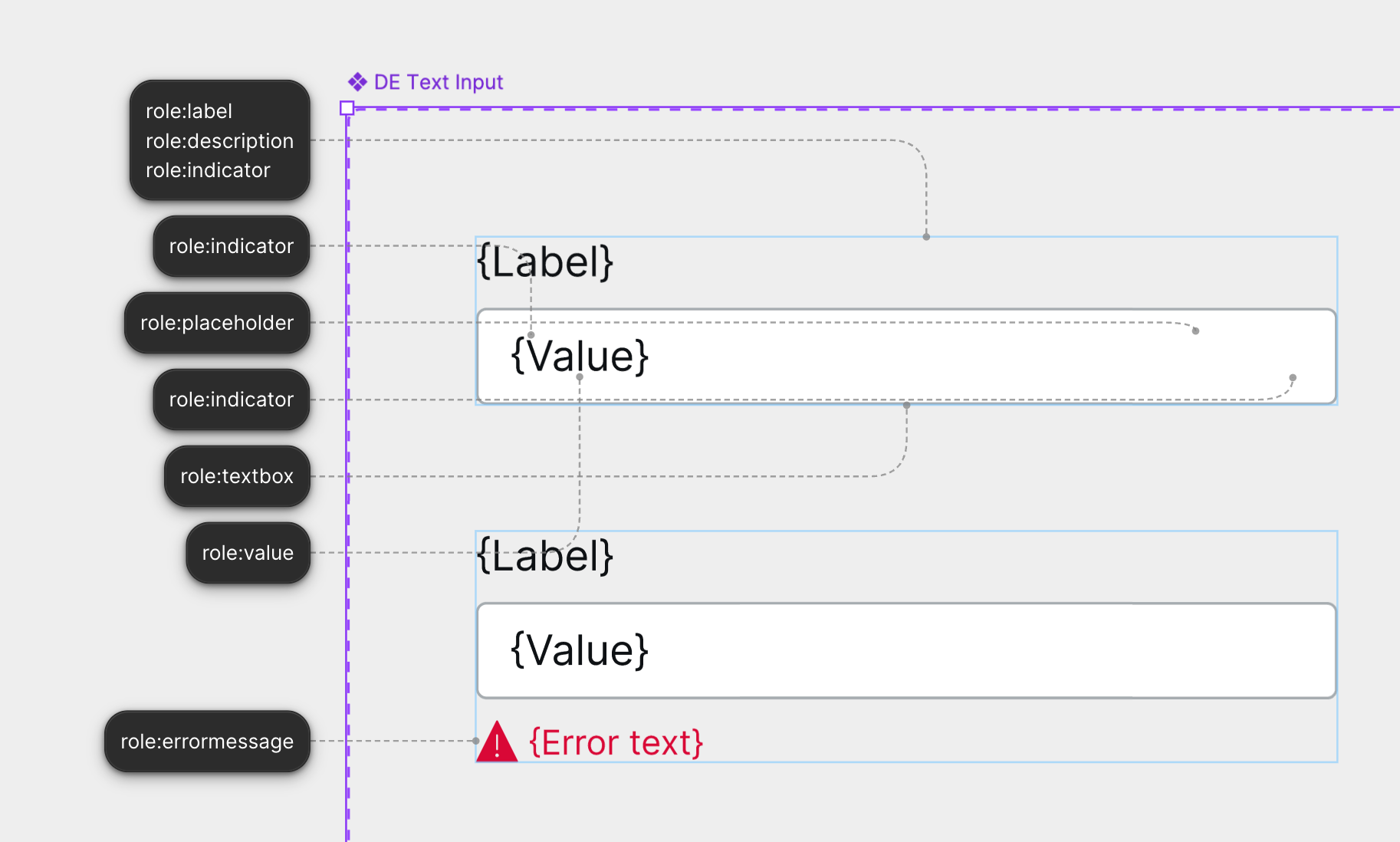
For example, a builder can now add a role:<role> annotation to Figma assets or specs directly. For a TextInput, there may be many parts. Equipped with role annotations, code generators can:
Adhere to a contract of expected props, such as
onChange,onBlur,onFocusonKeyDown,name,autocomplete, andvalueApply more states and their interactions natively
Handle precedence between roles, states, and actions and their composition
export function DeFavoriteButton(props: DeFavoriteButtonScaffoldProps) {
  const p = { ...DeFavoriteButtonDefaults, ...definedProps(props) } as DeFavoriteButtonScaffoldProps;
  const rest = restProps(props, DeFavoriteButtonOwned);
  const selectedProp = Boolean(p.selected);
  const [pressed, setPressed] = React.useState(selectedProp);
  const [prevSelected, setPrevSelected] = React.useState(selectedProp);
  if (prevSelected !== selectedProp) { setPrevSelected(selectedProp); setPressed(selectedProp); }
  p.selected = pressed;
  return (
    <button
      className={['de-favorite-button', p.className].filter(Boolean).join(' ')}
      data-element="root"
      type="button"
      aria-pressed={pressed}
      disabled={p.disabled}
      aria-label={p.accessibilityLabel ?? undefined}
      onClick={(e) => { const next = !pressed; setPressed(next); p.onPressedChange?.(next); p.onClick?.(e); }}
      onFocus={p.onFocus}
      onBlur={p.onBlur}
      {...rest}
      style={p.style}
    >
      <span className="de-favorite-button__hover" data-element="hover">
      </span>
      <span className="de-favorite-button__icon" data-element="icon" style={{ ['--glyph' as string]: glyphUrl("heart") } as React.CSSProperties} aria-hidden="true" />
    </button>
  );
}
A simple FavoriteButton component makes clear the role’s value. Instead of simply a “faithful visual rendering,” the FavoriteButton comes equipped with a pressed state, toggled selection, aria properties, and more all housed in a <button> element. The scaffold isn’t perfectly idiomatic React throughout, and there are parts an engineer would rewrite, duplicate or evolve. Yet it works, all sorts of behavior and accessibility from a simple togglebutton annotation.
For more on roles, read the overview and inventory.
Promoted primitives
Designers build examples with primitive Figma layers because composing with real instances in a design file is laborious. A text layer wearing the design system’s typography token is standing in for that system’s Text component. As a result, composition code is off-system, customized HTML primitives flowing inline styles.
deText:                                     # Component name
  elementType: text                         # Figma layer type
  map:
    - source: typography                    # Text style
      values:
        "DE/Body/Medium": { size: Medium }  # Figma style -> Component prop
        "DE/Body/Small": { size: Small }
        "DE/Body/Large": { size: Large }
    - source: textColor                     # Fill color
      values:
        "DE Color/Text/Primary": { color: Primary }
        "DE Color/Text/Secondary": { color: Secondary }
        "DE Color/Text/Brand": { color: Brand }
        "DE Color/Text/Disabled": { color: Disabled }
        "DE Color/Text/Error": { color: Error }
        "DE Color/Text/Primary Inverse": { color: "Primary Inverse" }
    - source: layoutSizingHorizontal
      values:
        FILL: { resizing: Fill }
        HUG: { resizing: Hug }
    - source: content
      prop: text
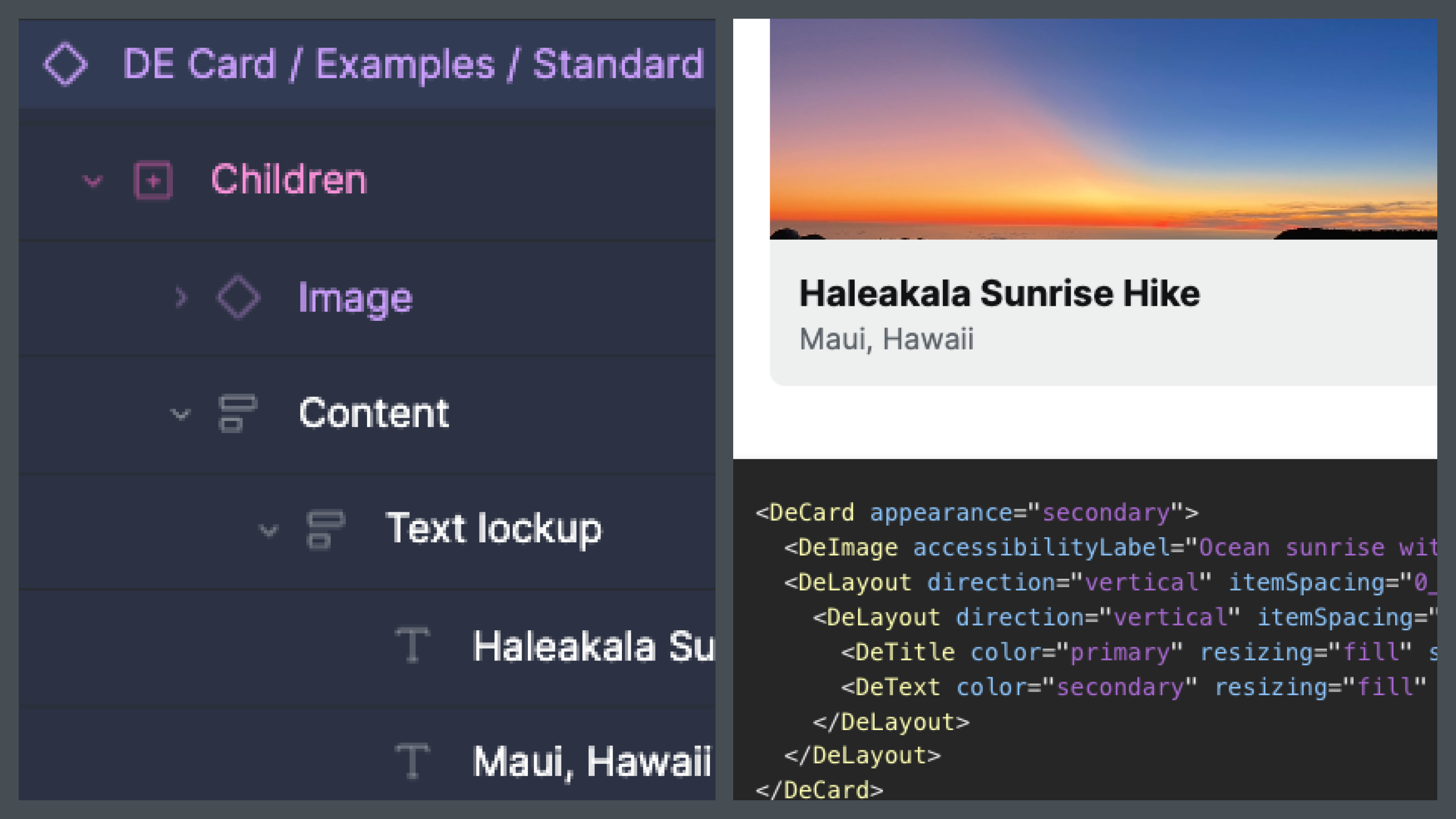
Therefore, specs can promote Figma primitive layers heuristically to official system components based on a well-defined mapping maintained by the Figma library owner. Every frame, text or glyph instance matching styling rules is converted to a core component (like a Layout, Text, Heading, Eyebrow, or Icon component) with a corresponding prop configuration.
// Before
<DeImage imageSource="/assets/images/36764b5822394a37a2d313c87aca01f0fca13f66.jpg" accessibilityLabel="Ocean sunrise with moon visible" aspectRatio="16:9" />
<div data-element="content" style={{ display: 'flex', flexDirection: 'column', gap: 'var(--de-space-padding-0-5x)', padding: 'var(--de-space-padding-1x)', width: '100%', height: 'fit-content' }}>
  <div data-element="textLockup" style={{ display: 'flex', flexDirection: 'column', gap: 'var(--de-space-item-spacing-0-25x)', width: '100%', height: 'fit-content' }}>
    <span data-element="haleakalaSunriseHike" style={{ width: '100%', height: 'fit-content', color: 'var(--de-color-text-primary)', font: 'var(--de-title-5)' }}>Haleakala Sunrise Hike</span>
    <span data-element="mauiHawaii" style={{ width: '100%', height: 'fit-content', color: 'var(--de-color-text-secondary)', font: 'var(--de-body-medium)' }}>Maui, Hawaii</span>
  </div>
</div>
Based on the mapping above, if the engine detected a text layer with typography (a Figma text style) of DE/Body/Medium and textColor (fill color) of DE Color/Text/Secondary that’s set to FILL the parent (the default), then it’d emit a <DeText size=”Medium” color=”Secondary”> in the code instead of a <div> with inline styling.
// After
<DeImage imageSource="/assets/images/36764b5822394a37a2d313c87aca01f0fca13f66.jpg" accessibilityLabel="Ocean sunrise with moon visible" aspectRatio="16:9" />
<DeLayout direction="vertical" itemSpacing="0_5x" padding="1x">
      <DeLayout direction="vertical" itemSpacing="0_25x">
            <DeTitle size={5} color="primary" text="Haleakala Sunrise Hike" />
            <DeText size="medium" color="secondary" text="Maui, Hawaii" />
      </DeLayout>
</DeLayout>
For more on promoting primitives, read about the setting and forming a table.
Engineering teams I work with are building factories of their own – scripts first, agents and humans at the end of the line. I continue to script things until the cost of scripting it exceeds the benefit of regenerating it. Somewhere out in that tail – advanced accessibility annotations, behaviors descriptions, my capacity – I’ll hit real limit and / or scripting will tire out. But I’m not there yet, and want to travel further.
Plus, I may be a Typescript developer but I’m neither a WCAG or React specialist. The former is a rule book, the latter is a rich framework I’ve barely tangled with. A specialist would go further with this pipeline than I can, if they saw value in it of course. For me, for now, production grade is a direction, not a destination. It helps me understand and thus communicate more about the components I define.
Even without the specs toolkit, the patterns convey: map your states to concepts, author structured annotations that convey into the pipeline, and hold whatever factory you run — scripted or agentic — to the contract, not the catalog.
Visit specsplugin.com to learn more and get started.