Configuration Collapse
As Figma Slots Push Composability, Be Ready to Drop Props

Glance at the Props panel of a mature Figma component, and you risk encountering a scrollbar of shame. Countless props fine tuning element visibility (like showIcon) and layout (horizontal or vertical direction). Each solves for a real yet specific case, added with the best of intentions.
Yet together, those “helpful” and enabling props sprawl into a paradox of configurable choice. When component variant counts explode or a simple change breaks an inherited style, it’s not because the design system is flawed—it’s because it’s using the wrong tool. The system further burdens itself to document, test, and maintain more features, locking it in a box of its own making.
A single, rigid component need not solve all things for all people.
Figma’s native slots are coming for your configurable props, and will tear many of them down. System power should come from not switches and variants, but by allowing for creative, unconstrained composition. This will demand a bold act: a configuration collapse to drop props that make components fragile.
This article explores this shift by moving our prop-first mindset to purer composability, with examples of the Pill, Alert and Card.
A Leaner Component Core
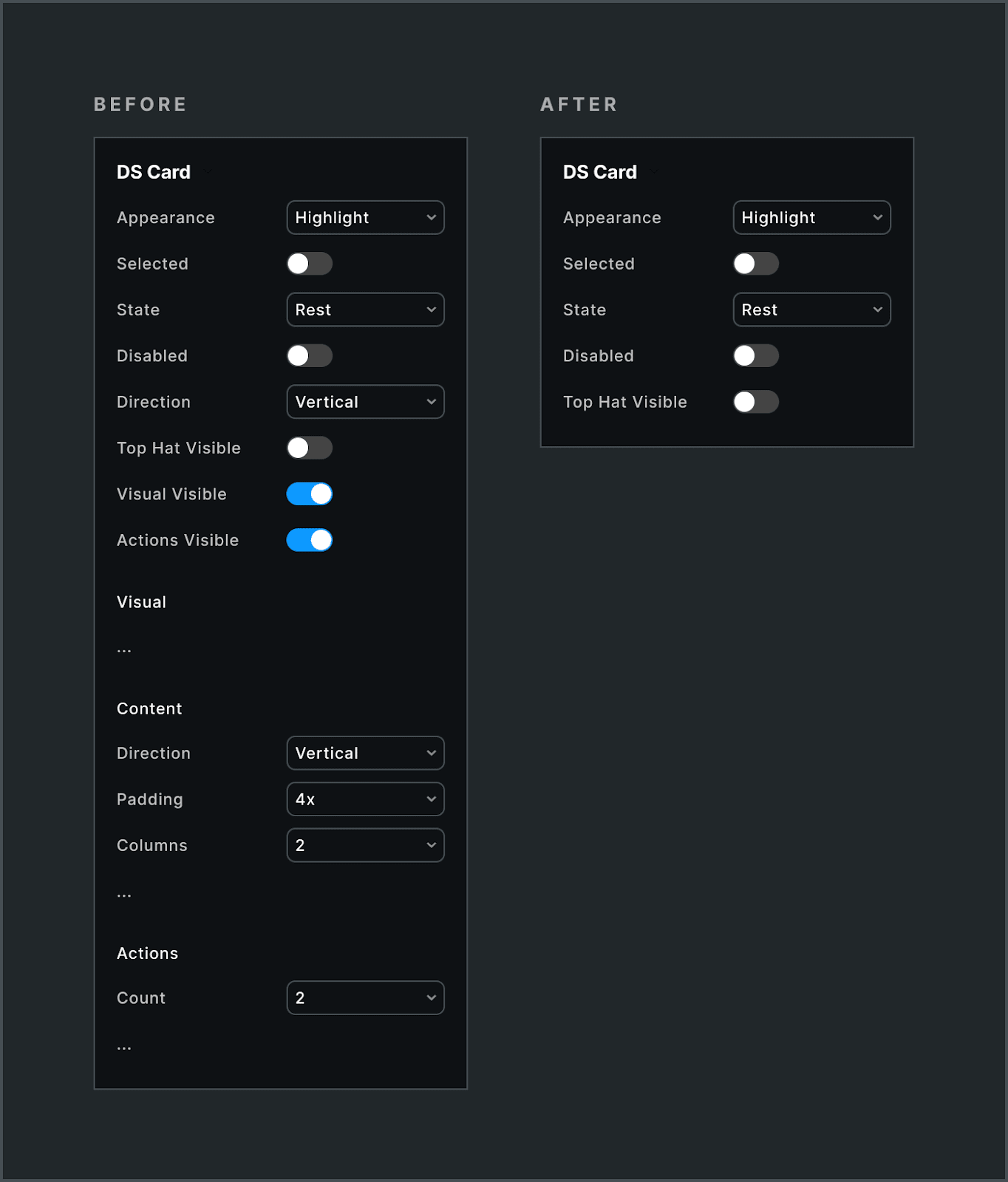
Shifting towards composability must leave the component’s identity untouched, retaining only behavioral and foundational visual props—such as state, appearance, and size—as the component’s essential, top-level API.
Yet many other props types and subcomponents are at risk, like:
Layout props for
padding,direction, andresizingare removed.Visibility props (Figma BOOLEAN props like
showIcon,hideDescription,actionsVisible) declined severely in favor of controlling element presence and visibility via slot composition.Visual hack props declined, particularly those impacting single visual choices (e.g., color, corner radius, or border) of a nested layer.
Subcomponents for varying layout and element structure were eliminated entirely (see the
Alert>Body>Textexample below).Configuration shifts removed complex props (
actionsVisible,actionsCount) in favor of a dedicated, simpler subcomponent that’s slotted into the main component with potential constraints.
Decoupled visual styling of composed children (e.g., the text color of a Button Label or a Card Title) is an undesirable but necessary trade-off. These relationships have efficient, effective controls in code, but become the composer’s responsibility in Figma. Use strong, variant-specific defaults and rich examples to mitigate this challenge.
The immediate effect is leaner component APIs. In the long-term, teams and systems across the enterprise can better extend, build around, and build within core components without conflict and delay.
Why Now? AI-Ready Components
Design systems have been built for composability for some time. Systems have been putting the right props at the right levels of the right components. Putting things together feels right… in code. But not in design tools. And certainly not in design tools increasingly manipulated by AI.
Because Figma can compose in components now
So the easy answer is: because designers couldn’t do this before with Figma. Native slots – or more abstractly, composition within a component asset – was too difficult and clunky to replicate, so Figma’s architecture was different.
I think Figma prioritizing building slots in 2025 is neither because slot utility instance swapping sucks (it has for years) nor that slots just happened to be next on the roadmap. I speculate that slots are a priority because machines now compose interfaces and Figma needs customer’s assets ready for the challenge.
Component composition is grammar
In a prop-heavy system, element relationships are implicit and bound to prop combinations that are arbitrary and often quite uncommon. With composition, relationships become explicit: a Pill is composed of an Icon and text Label inside it, each with important yet contextual configurations of their own. This creates structure that AI can read, understand, and generate.
Favor predictable patterns over hyper-configuration
Also, a reduced configurable shape improves predictability. Figma boolean and layout variant props feel arbitrary and don’t cover all possible needs anyway. Instead, systems should supply AI with training data that records relationships in other ways, such as ready-made examples augmented with guidance. Models could perform better with fewer yet higher-confidence patterns rather than spinning on copious, hyper-specific configuration states.
Layer semantics over flexible building blocks
Figma’s slot composition also opens up opportunities to build purpose-driven components (like a ProductCard with opinionated structure and layouts) by wrapping a composable Card container starting point. This more effectively separates concerns, affords extensibility, and improves autonomy.
The takeaway shouldn’t be to “Drop all the props.” Instead, it’s about finding the right balance. It’s still essential to offer the right configurable choices at the right level without necessarily rigidly controlling what’s inside.
Make the common configurable, make the uncommon composable
Moreso, it’s about tearing away the structural noise from our configurable surface. Now’s the time to put compositional choices in the hands of the composer, scaffolded with starting points and guided by rich examples and context
Examples
Start and End Visuals
Many more atomic components like Pill, Badge, Chip, Tab, Link, and Button have Start and/or End visuals on either side of a label. In the past, to control for a set of expected visual types (like an Icon, Mark, Image or Avatar), we’d use a component or subcomponent variant prop.
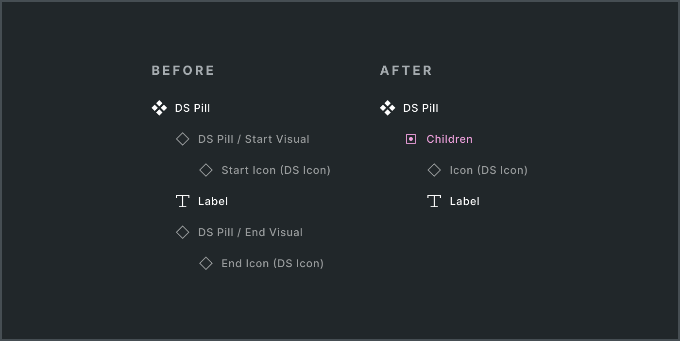
With native slots, favor flexibility and ease over control. Nesting text and paired visuals (either hidden or visible by default) in a children slot.
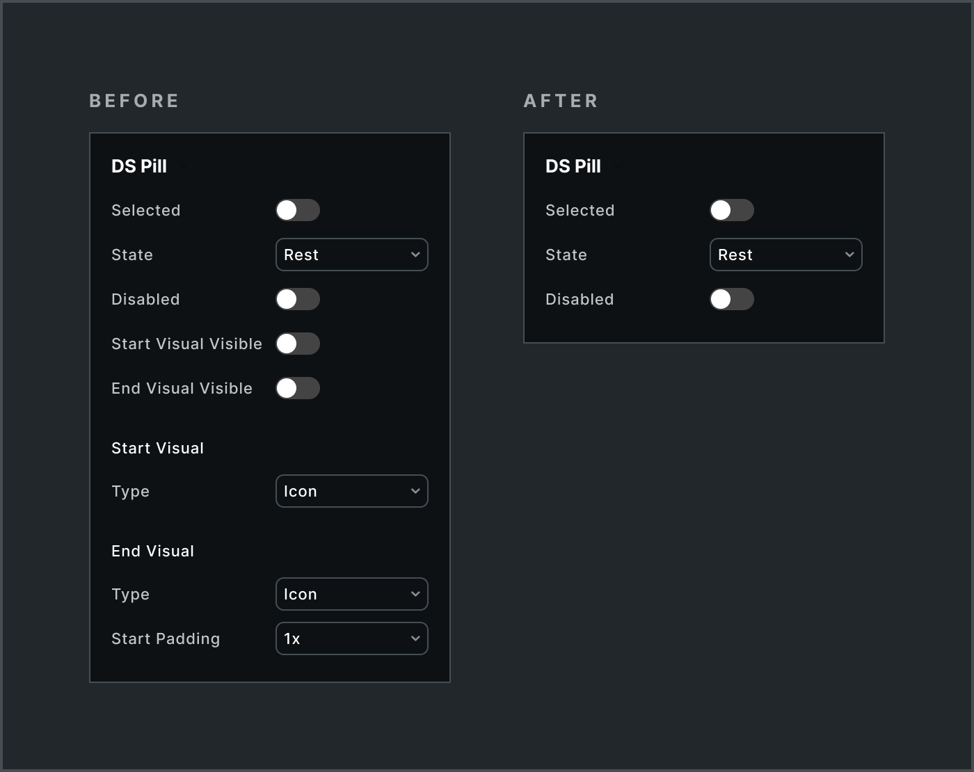
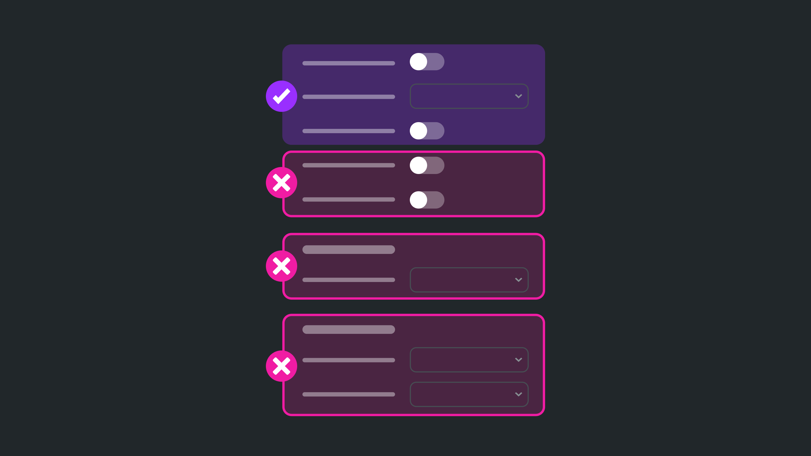
This resulted in a near complete collapse of some component’s props, including:
All visibility props (
Start Visual Visible,End Visual Visible)Type variant props
Paddingvariants that controlled spacing between a label and visual, omitted in favor of a composer implementing that choice.
Icon is a predominant default visual. Certainly, adding it as a slot “Preferred Value” is a start. However, inserting it results in a likely Icon configuration mismatch. Alternatively, it could be included by slot, whether shown or hidden by default. That way, the Icon can be configured to match the parent state, such as Pill selected‘s impact on Icon‘s appearance.
The need to control was rare but did arise, such as Button / Start Visual. This strongly typed subcomponent reinforced expected use, even if it could be omitted and a different element included just in case.
Body, Text and Actions Layout
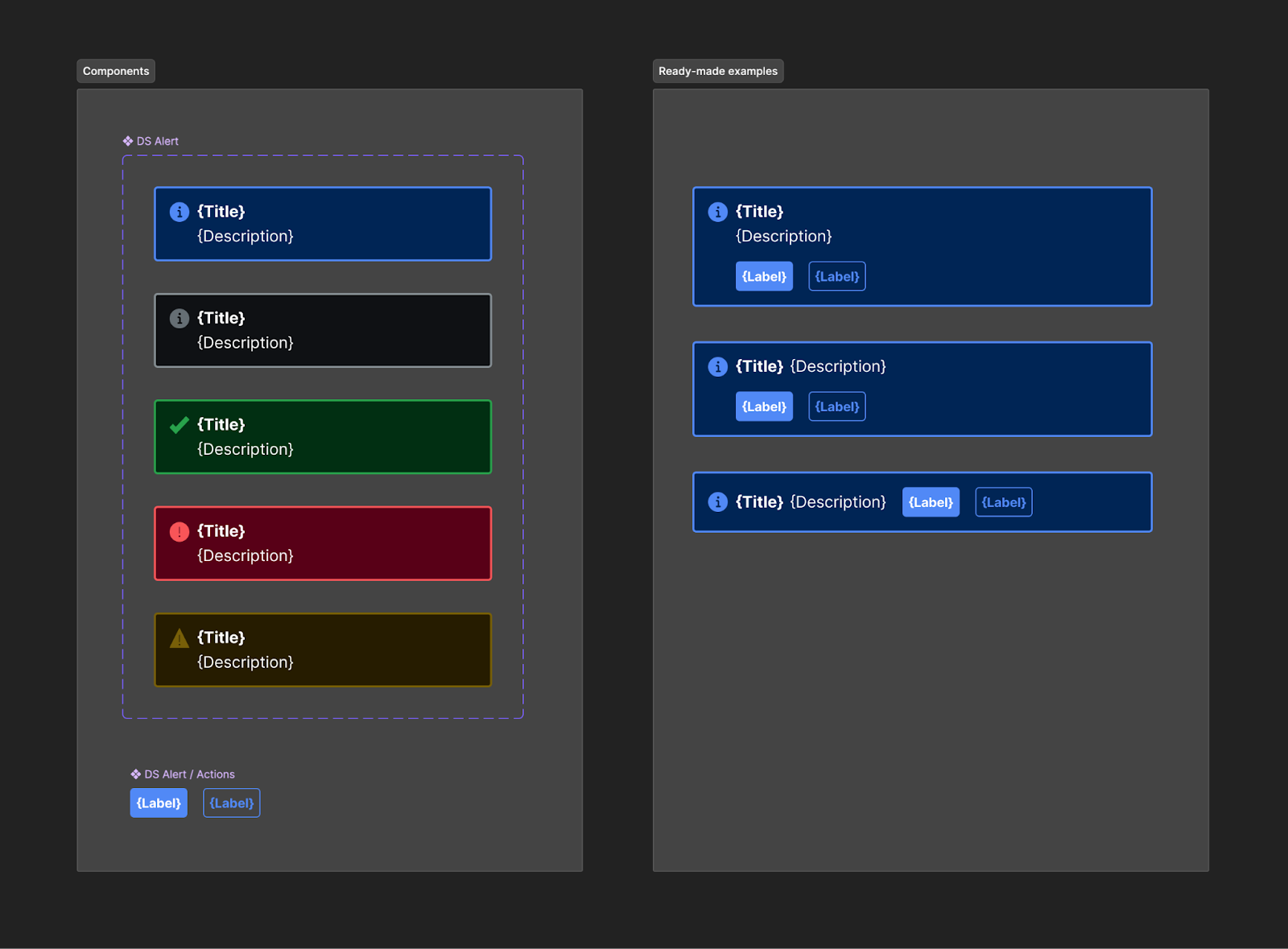
As component structure becomes more complicated, varying layouts and included elements become more common. For example, an Alert component may include a Title or Description or both as well as arrange those horizontally or vertically as well as their combination horizontally or vertically with Actions. Sometimes, the entire Alert’s Body may need to be customized.
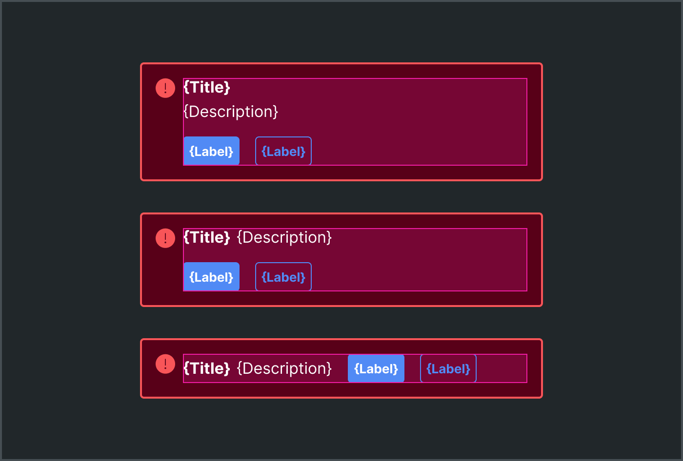
This can be achieved with subcomponents, each with variants controlling layout directions (at multiple levels) and element visibility. “Most” layouts become configurable. Yet the overwhelmingly most common layout is all elements vertical, and three-level deep subcomponents always felt quite brittle.
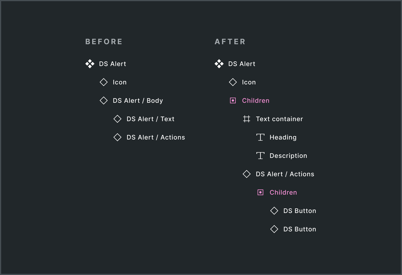
Alternatively the elements – both text elements like Title and Description as well as frame containers – could be included in a slot. This scaffolds a starting point with everything you need, enables rapid layout refactoring using the frames equipped with autolayout, removes the need for Body and Text subcomponents altogether. Anchoring on the predominant layout felt liberating.
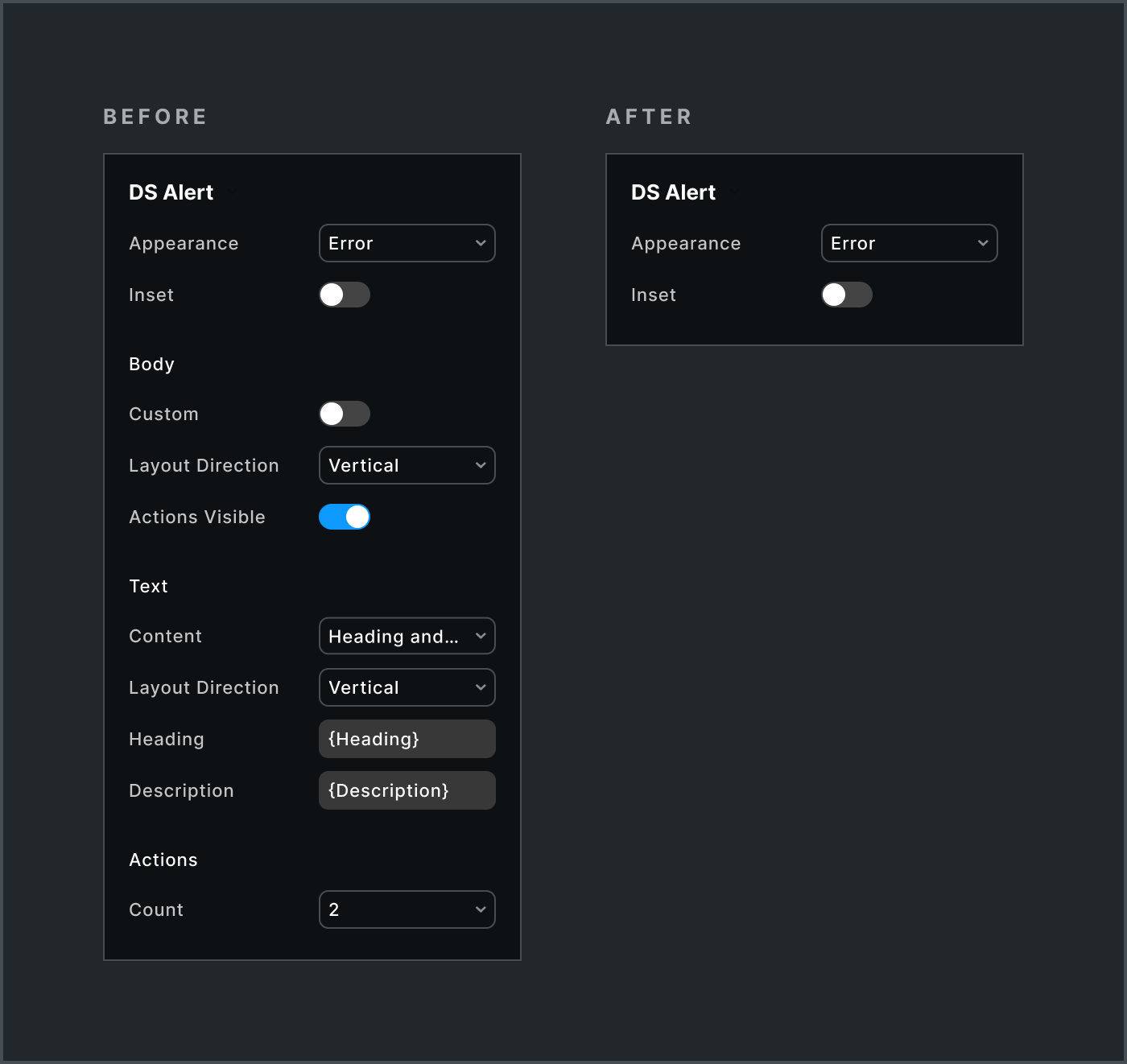
As a result, subcomponents and their layout, text and visibility props vanished. Instead, the component asset was coupled with a few ready made examples of the alternative layouts. Designers have everything they need to achieve the outcome they want as quickly as before, yet with far more flexibility.
Card
Early Card experimentation focused on common structures – Visual, content layouts, Actions. Depending on the design system, that could result in useful, composable subcomponents that recombine in a few predictable ways.
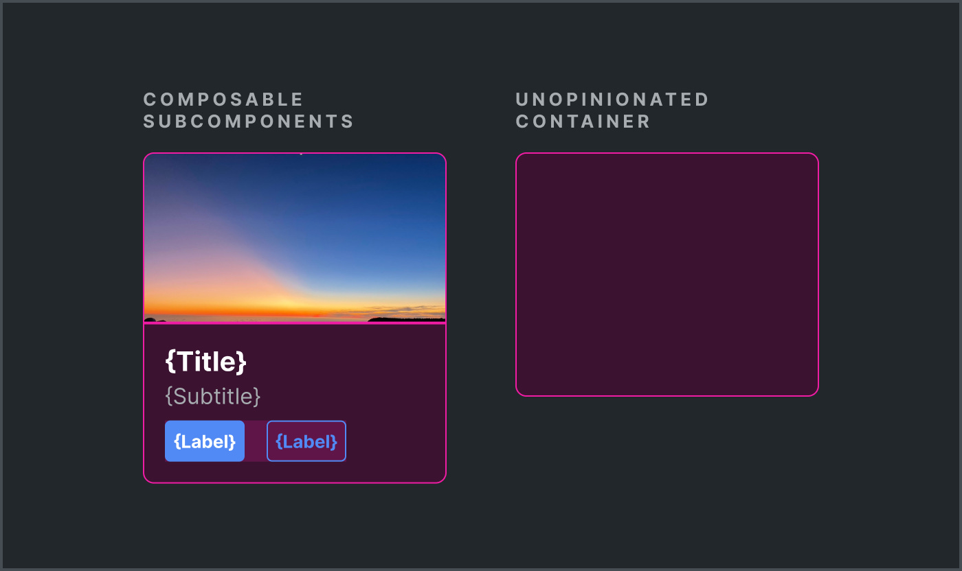
Not this particular system. The system served divergent experiences spanning 50 brands. There simply was no predominant default, or even common limited collection. Instead, the system would likely require a deep collection of diverse ready-made examples. As a result, for the core library at least, it made sense to hollow out the Card to an unopinionated container.
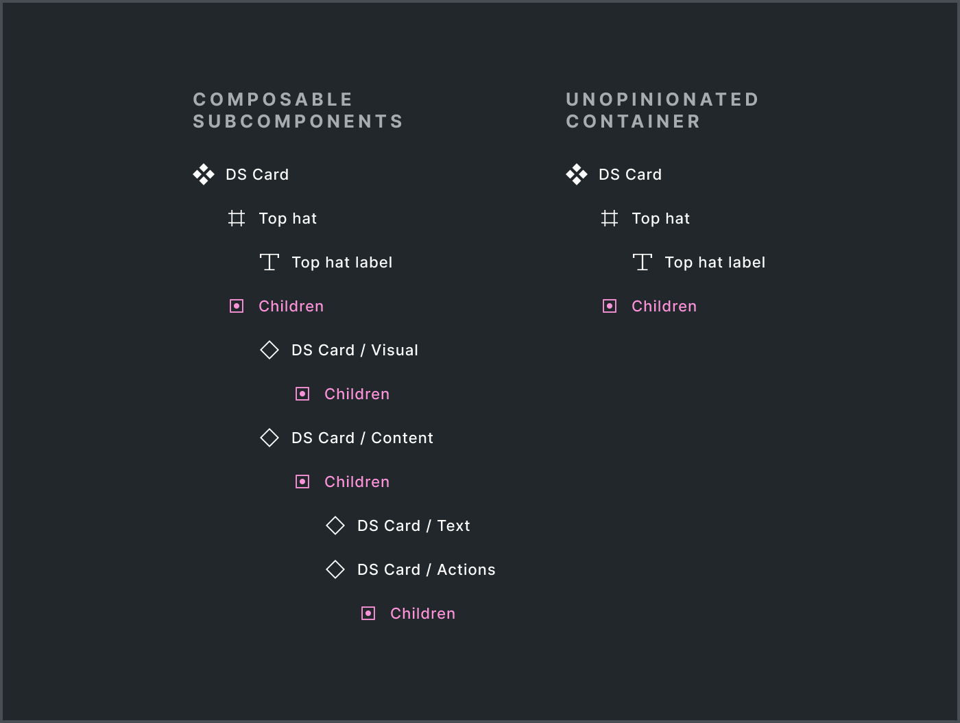
With a hollowed out container component, that meant the core library deliberately offered no configurable subparts. There’s justification for a composable Card / Visual , but the core team might rather focus on offering an Image component that you can overlay custom content instead. The Card / Actions subcomponent would echo the pattern established by Alert, but actions too were too diverse to normalize. Why bother? Just compose what you need.
The core Card’s unopinionated container is a strategic choice. Less is more. It acts as a maximally flexible foundation without imposing constraints, enabling other teams to build purpose-driven extensions.
A separate team has already begun. They’ve initiated a separate library, signaling a rich array of even more hyper-specific card content subcomponents and zones, layouts and visual expression. The design system will then weave those inspirations in among the broader collection of ready-made examples to guide everyone.
There’s no one shape that’s perfect for everyone. I’m making different judgments for different design systems as I go to get to the goodness-of-fit that works for each case. Onward!
Loving the examples given here. Have you considered (or do you have) a community Figma file for slots related work? Would love to dive into these examples and play with your methodology.
I'm just here to slow clap for "scrollbar of shame".