
Nearly a decade ago, I wrote of my passions stirred by crafting tokens in design systems. Those (sub?)atomic, minimal decisions were invigorating as we put structure to visual choices as data to spread across a system. The muse of that story? The Pill component.
This year, my team initiated a catalog-wide component-by-component refactor. This time, again, we started with the Pill component. It’s as if the Pill offers us a choice: see the truth of our explicit decisions, or stay in an illusion that manual handoffs and divergent tools carry our intentions into the work of others without failure. Ok, maybe that’s a bit heavy handed. Enough with the heady metaphors.
Throughout the project, my role is to architect how we record component decisions as structured data independent of any platform, including Figma. I’m responsible for ensuring consistent, scalable, and interoperable components that flow into and from Figma and a pipeline of generated, cross-platform code. It’s delightfully complicated. Tokens feels quaint by comparison.
This slot prop. That container element. Both are familiar and feel simple. Yet conveying visibility and children from one to the other, binding and unbinding references across an array of variants? That hits different. Chats evoke nullability. We’re overdosing on overloading. Figma’s threshold of what you can express and how you express it feels a barrier. Huh, hold up. What’s … nullability?
These days, I live much more in a text editor than a UI to plan, design, validate and deliver components as data with AI at my side. In this post, I provide a glimpse of components expressed as data and follow with why treating using data matters across a component’s life cycle in the era of AI.
Defining Components in Data
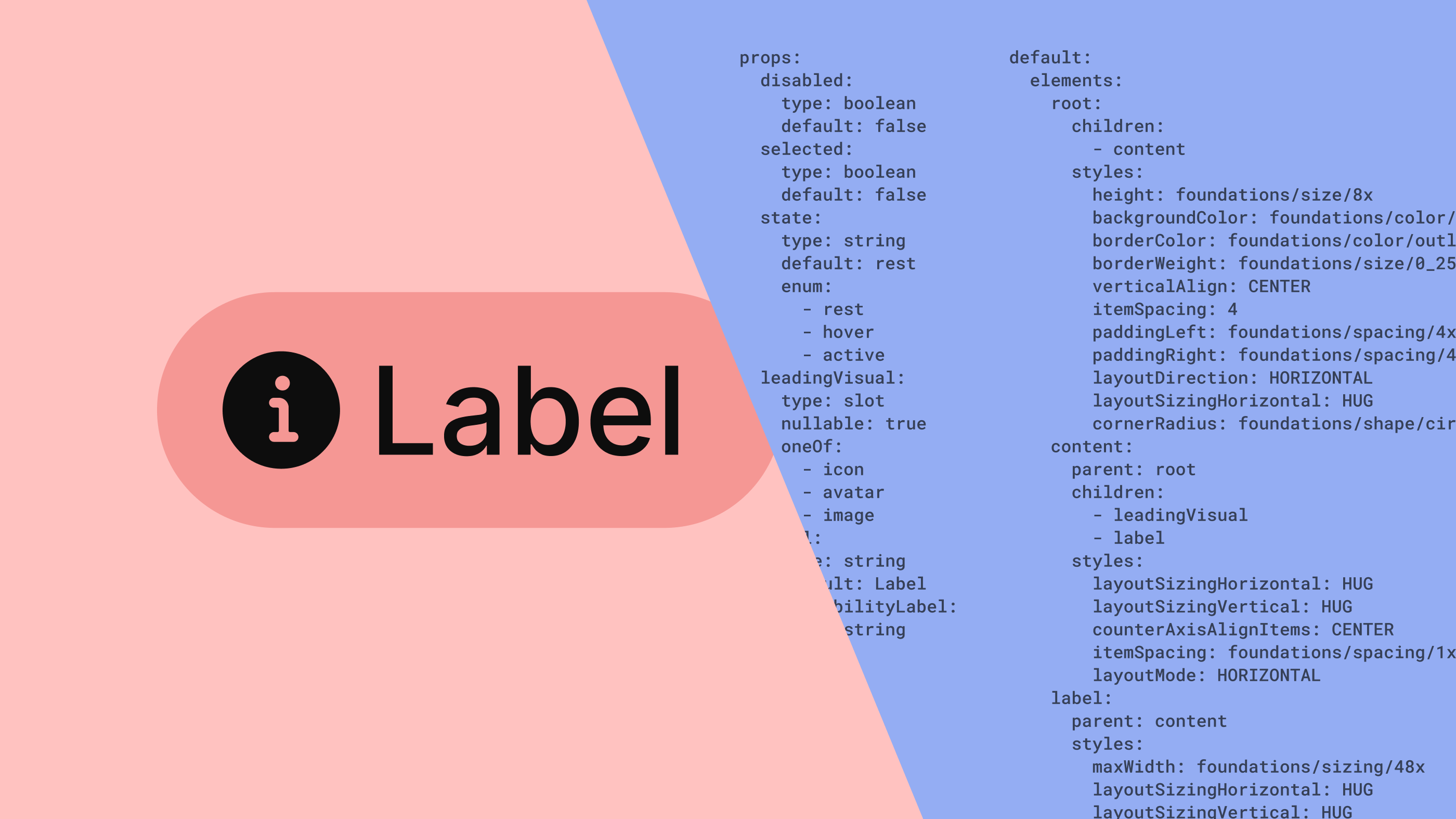
A component definition in data is a structured description of a UI component expressed in a neutral format (like YAML or JSON) instead of hard-coded in design tools or platform-specific code. Data breaks a component into parts like an anatomy of elements, props, styles, layout and how each varies when configurations change.
Anatomy
A component’s elements of various types (like container) organized into a hierarchy comprise its anatomy. Element concepts correspond to platform-specific constructs, such as a Figma FRAME layer or HTML DIV, SPAN, or SECTION.
anatomy:
  root:
    type: container
  content:
    type: container
  leadingVisual:
    type: slot
  label:
    type: text
Props
Props to configure a component’s behavior and appearance and can be various data types, such as booleans, strings, enums or slots.
props:
  disabled:
    type: boolean
    default: false
  selected:
    type: boolean
    default: false
  state:
    type: string
    default: rest
    enum:
      - rest
      - hover
      - active
  leadingVisual:
    type: slot
    nullable: true
    oneOf:
      - icon
      - avatar
      - image
  label:
    type: string
    default: Label
  accessibilityLabel:
    type: string
Within a seemingly simple prop list, subtleties complicate conversations for designers expressing ideas in Figma.
Aren’t
disabledandselectedtechnically enumeratedVARIANTprops with enumerated values fortrueandfalse? Yes.Is
leadingVisualanINSTANCE_SWAPprop, and don’t we need anotherBOOLEANprop to control its visibility? Yes (that’s how slots work today in Figma) and yes (the need for aBOOLEANrelates to thenullableproperty).How do we even represent accessibility labels? Expose a
TEXTprop in the Props panel but not visually. There’s a trick for that.
Those conversations highlight the act of translating a component definition to a platform, in this case Figma.
Styles
Styling is directly expressed in data in a human-readable way, too.
default:
  elements:
    root:
      children:
        - content
      styles:
        height: foundations/size/8x
        backgroundColor: foundations/color/surface/primary
        borderColor: foundations/color/outline/primary
        borderWeight: foundations/size/0_25x
        verticalAlign: CENTER
        itemSpacing: 4
        paddingLeft: foundations/spacing/4x
        paddingRight: foundations/spacing/4x
        layoutDirection: HORIZONTAL
        layoutSizingHorizontal: HUG
        cornerRadius: foundations/shape/circle
Here, a root element (in Figma parlance, the COMPONENT or INSTANCE layer) has a range of default styles that mix raw values (4, HUG) and token references (foundations/size/8x).
Yet, the element also omits presumed initial values (paddingTop: 0) and has implied values too (layoutSizingVertical must be FIXED because height is set). Even within styling alone, our team’s vocabulary must level up to describe concepts we’ve implicitly used before but never named.
Variants
Things get more interesting as prop configurations apply. In this simple example, a Pill‘s hover state changing the root’s background color.
variants:
  - configuration:
      state: hover
    elements:
      root:
        styles:
          backgroundColor: foundations/color/interactive/hover
Yet, variants can get complicated quickly, with two or more props interacting in a configuration to impact many elements at a time.
Broad, Detailed and yet Incomplete
When put together, these models combine to form a fuller picture of a component, in a structure like:
{component name}:
  anatomy:
    {element name}
    ...
  props:
    {property name}
    ...
  default:
    {element name}:
      styles:
        {style name}: {style value}
    ...
  variants:
    - configuration:
        {prop name}: {nondefault prop value}
        ...
      elements:
        {element name}:
          styles:
            {style name}: {style value}
     ...
Simple components (Divider 👀) may only need 20–50 lines of data. On the other hand, sophisticated core component like Alert, Text Input or Card often require 500 lines or more.
Yet, even with over 1,000 lines of data, a picture could remain incomplete, lacking considerations like:
Binding configurations to an element’s values
Motion and nontrivial Interaction that designers could express in Figma (using
reactions) but rarely do.Accessibility that Figma lacks the ability to express in a structured way, although plugins help with that.
Non-visual configurations, such as an
Alert‘sautohideduration orTextArea‘smaxRowsthat a designer could decide for handoff.
Varyingly, teams expand the shape of data to include more and more of these considerations through a combination of Figma capabilities, plugins and team-specific conventions. That said, teams continue to pair component data with a separate, unstructured document to “handoff” a complete component definition. For now, anyway.
A component catalog
Teams produce, store and version data for an entire component catalog in a database or (usually, in my experience) as a JSON or YAML file.
components:
  alert:
    ...
  banner:
    ...
  breadcrumb:
    ...
  button:
    ...
  card:
    ...
  icon:
    ...
  iconButton:
    ...
  pill:
    ...
  tabs:
    ...
  textArea:
    ...
  textInput:
    ...
A core.yaml file for a design system’s core components may include 30–50 components (and their subcomponents, too) and be 10,000s lines long. Want to store a component per file? Sure, tool it up that way. Want to separate concerns of component API from theming via tokens? Sure, as you will. You decide.
The Impact of Components as Data
Definining components in data form rather than passing unstructured artifacts between collaborators unlocks many opportunities across a component’s life cycle.
Leverage components in LLMs
AI is everywhere, and it favors structured data. So express components that way. An LLM can answer questions about how the component works, compare it to implementations, and propose improvements via prompts.
Sure, you could leverage Figma’s Dev Mode MCP Server. But beware: that’s a stochastic, incomplete, and imprecise component description biased towards one platform (like React) and framework (like Tailwind). More formally approaching component data makes component knowledge reusable, scalable, and consistently interpretable across contexts.
Inspect component precision and quality
With countless design decisions woven into our Figma assets, it can be hard to wire up every detail without errors. Data exposes errant design decisions, making components easier to audit.
variants:
  - configuration:
      state: hover
    elements:
      root:
        styles:
          backgroundColor: #045bbc  ## Seriously? Token please!
If I had a nickel for every time I detected a raw value in a stray variant when a token is needed (like the hover backgroundColor above), I’d be rich. Seeing components as data make inspection straightforward and precise, raising the quality of both design and code implementations.
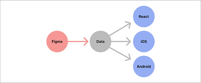
Generate components across code platforms
Instead of hard-coded spec documents or screenshots, developers receive machine-readable definitions. These definitions of structure, styles, and prop behaviors can be used to scaffold code directly. This reduces or even eliminates back-and-forth to ensures product matches design intent.
Generate Figma assets, too
And this isn’t just for code implementations. Teams generate Figma assets too. Soon to be gone are the tedious, manual hours to produce countless variants.
Instead, Figma component assets can be automated from a component definition in data that I plan in an hour and iterate with teammates for another. While we may go back and forth between Figma and data to refine and experiment, designers are increasingly focusing on architecture more and pointing and clicking and dragging and setting values in the Figma UI less.
Generate examples and documentation
The same data can be used to automatically create component reference pages, usage guidelines, and visual previews. This removes the need for manually maintaining documentation that quickly falls out of sync. As components evolve, the documentation updates with them, staying consistent and trustworthy.
Version component definitions over time
Component definitions as structured data be tracked in version control systems like Git. This allows teams to see how components evolve, compare differences, and roll back if necessary. It creates a durable record of a component’s lifecycle, just like other source code.
Analyze components across a catalog
With many components defined in the same format, you can prompt AI to find patterns and gaps like:
How and how often is the
foundations/color/surface/secondarytoken used?
Are enumerated options forstatehandled consistently?
AreaccessibilityLabelsapplied across all potential cases?
This enables data-driven insights into a system’s health and coverage.
As an architect at heart, I’m so excited that my work has evolved into increasingly formal structures to describe UI components. This era of AI demands that we shift and evolve how design systems work. It’s difficult to imagine returning to a time when I architected components only in a visual tool like Figma. Instead, my mind races faster seeing those impassioned decisions as data, moving through the connections we create.