Component Examples as Data
Demonstrating what’s possible for designers and machines alike


The empty card. Drop it on a canvas and it stares back: unopinionated, empty, waiting for instruction.
In composable component catalogs, it’s common for assets like a Card to either offer a default scaffold of simplistic content or – when there’s no predominant default – nothing at all. The starting point leaves an author tremendous flexibility, but uncertainty too. What am I to do with this? What am I permitted to do with this? What’s possible with this?
Crafting the best UI component isn’t just authoring configurable props and varying visual style and layout. System designers should also express a component’s composable potential and intended use. Those downstream depend on examples: designers see range and start fast, system engineers get pre-validated, on-foundation starting points, and AI gets a corpus encoding patterns, rules and guidance.
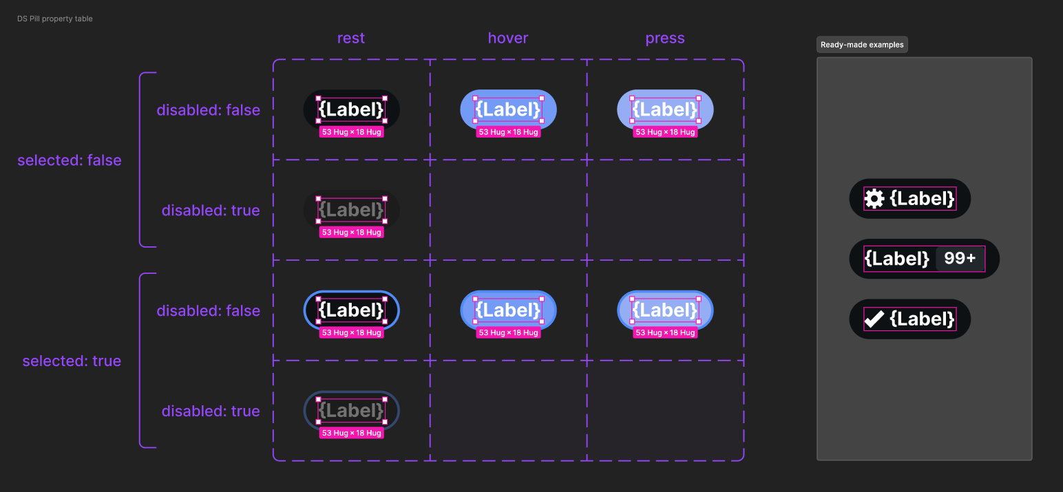
Which components actually need examples? It’s definitely not all of them, but it’s more than you think. Sure, the Card, Modal and Sheets of your system intend to provide a composable body and even customizable headers and footers within. These shells benefit greatly from examples. Other components like Rows in feeds and e-commerce tightly orchestrate visuals, content and actions. Even configurable atomics like Pill and Button – used at high volume and customized very infrequently – may require a composition from time to time.
This post describes what examples are, where they fit, why they matter, how they demonstrate a range of composable possibilities, legible to both humans and AI alike.
About Examples
Ready-made examples build upon the configurable component asset that all catalogs start with. They are additive, built beside the configurable asset to represent the component’s potential distinct from what otherwise could become a sprawling matrix of brittle variants. Composing examples redirects teams to spend time to demonstrate possibility rather than engineering yet another multitude of variants to achieve a single requirement. It answers what can I make with this as an improved well crafted starting point that people can duplicate and take from there.
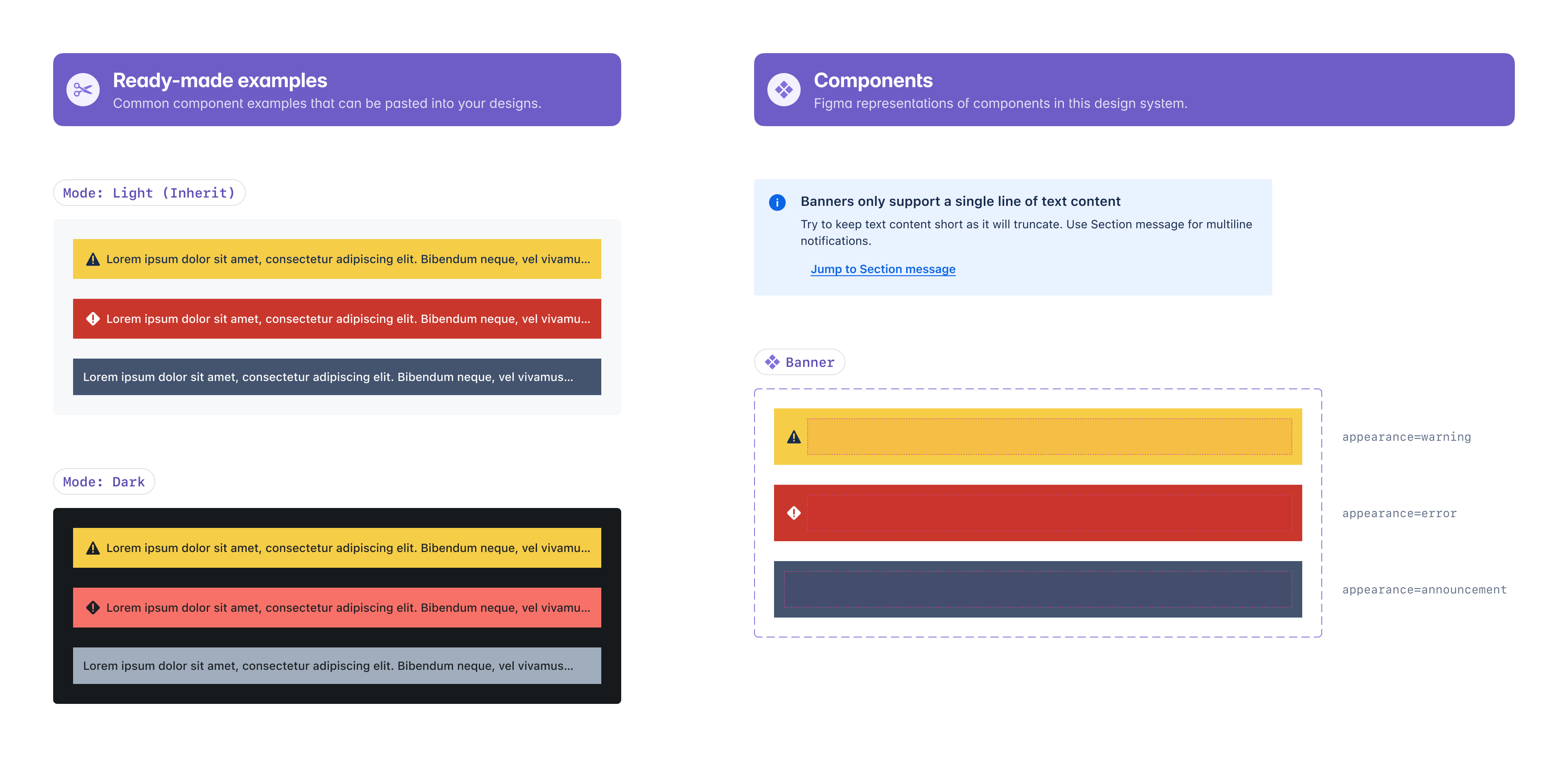
Design systems have been crafting ready-made examples for years, as demonstrated by Atlassian’s Figma library published on the Figma community. Examples are often positioned to the right of the component set and parts as one of often many other authored outputs (such as specs and change history). While historically also possibly in a sticker sheet on another page or even in another file, most teams today position these directly adjacent to the component asset itself.
Make the common configurable. Make the uncommon composable
The craft that makes a component quality clear to a designer is the same that makes it legible to a machine. Props aren’t enough. Ready-made examples are not variants that show up as a configurable surface. Those props represented as a Figma variant grid or Storybook stories represent what’s built into the component. Composition goes wider, and examples take us there.

Component test cases pressure test a component, but lack nuance and intent. As configured alternatives, they’ll miss the real thing: composed arrangements, real content, custom binding and styles that bring a component to life. Examples bring humans and machines out of the narrow, configurable essence towards how components fit together to solve problems.
Slot Default Content is an Example, Too
Now that Figma has enabled slots, examples take on an extended importance. Component assets can now include example slot content as a customizable scaffold directly in the asset itself. Make no mistake: this content is NOT part of the component’s configurable contract. Nevertheless, a slot’s default content expands how system designers convey intent and provide a starting point to be extended and overridden.
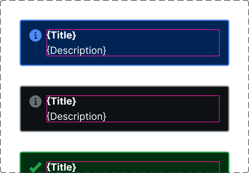
Default slot content also challenges system designers to assess the component’s configurable boundary. What elements should only be configured? What elements are suitably composed in a slot? When the latter, to achieve what kinds of result? Formalizing examples – including the content scaffolded within an asset’s slot – enables system practitioners to illustrate both configurations and compositions beside and within assets.
Examples Illustrate Common Customization
“Simple, atomic” components like button may warrant only one or two examples, such as with a counter or loading spinner. Having a composed example sends a signal: it’s OK to customize when the time is right. From there, ready made examples provide the place to demonstrate a range of component concerns across many axes.
The Alert component demonstrates a widening array of shifts. Variants capture changes in icon and color per configuration and examples broaden the story
When using this Alert, it’s ok to…
insert
elementslikebadge, dismiss button, o drawercustomize
styleof elements like text to increase a font size or a frame to create additional emphasis or spacerearrange
layout, like vertical or horizontal direction of elements and areasexhibit what elements are essential elements, like a title or description or both
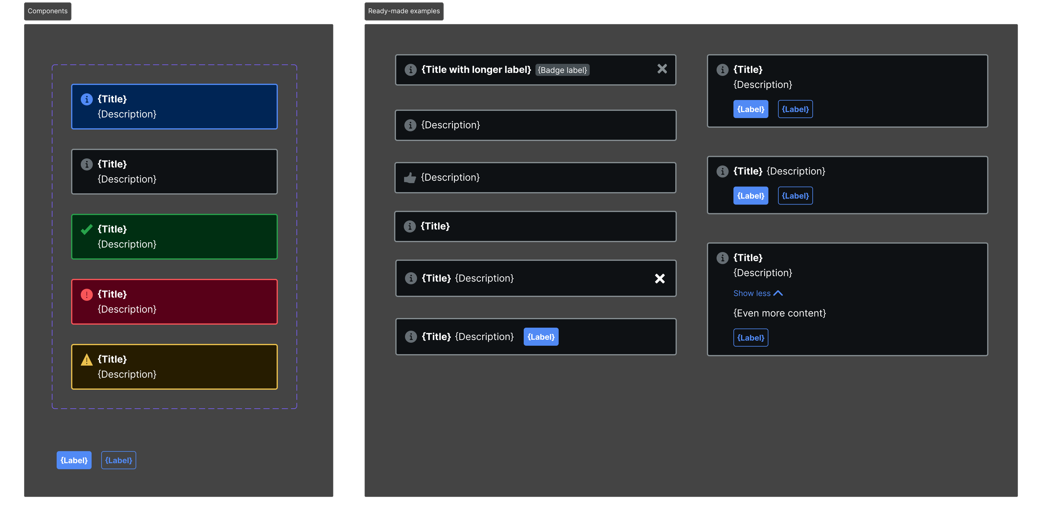
So look at a component with a different lens: how might its elements, styles, and layout shift in ways that configurable props don’t – and shouldn’t – control?
Examples Data Consumed Downstream
Example data fidelity matters: screenshots may be good, code may be better, but well modeled component data is best. As examples proliferate, we’re building mechanics to capture these examples and project them through the rest of the pipeline. Generating examples as data from Figma can be useful for generating many outputs. The same Card example renders the React doc page, seeds a Storybook story, and answers a Cursor prompt for a pricing card.
As such, I’ve integrated `examples` into my Specs plugin and Specs CLI framework as a first class component output alongside `api` (props and elements) and styling rich `variants` (default and variant-based shifts in styling, layout and bindings). This positions examples in the same flow as handing off design: author examples (today, in Figma), generate the data, use for downstream applications over and over.
Two new data shapes are emitted:
instanceExamples, corresponding to the ready-made instances of the component assets matching particular naming patterns and/orparents in the Figma page (like a frame or section named “Examples”)slotContentExamplesfor each slot composition of content referenced in aninstanceExampleor embedded as default slot content in the component assets
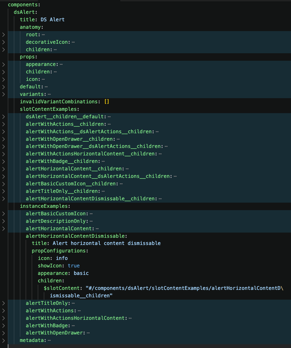
instanceExamples and slotContentExamplesFor now, we’re limited to using the instance layer name to connote a basic description and we’ll experiment with how to layer in guidance (do/don’t, must/should/could/avoid/never, etc.) as relevant.
Example Intent and Guidance
In the case of a Row component, the subtle shifts of structure and styling are evident across this gallery of seemingly similar variants. When you look closely, it’s clear that capturing all of these shifts as configurations is a fool’s errand.
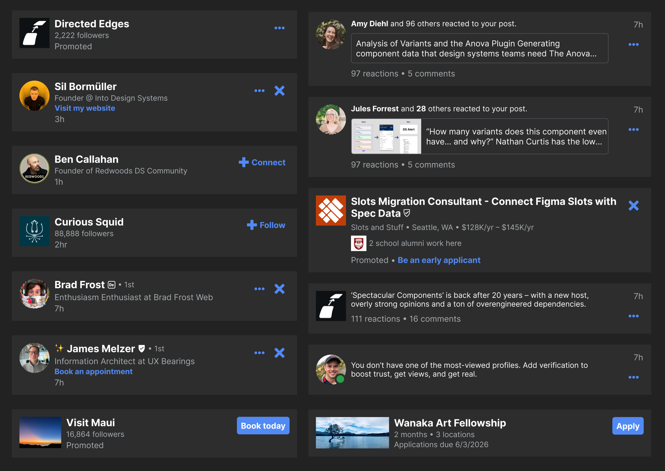
All three areas – visuals, text, and actions – are wildly divergent.
Visuals may be square or round, image or avatar, and include or exclude a highlighting border.
Text may include two or three lines, strategically included links and actions, formatted and highly structured data, and even a child highlight box (and that, with an image too!).
Actions may include buttons or icon buttons, horizontal versus vertical displays, menus, one or many. Even the right corner can include plain text too!
So as you craft examples, you’ll focus on expressing:
Structure of
elementsandlayoutthat composition extends and bendsStyle, favoring formal, semantic tokens over hardcoded hexes and cheap, one-off spacer frames
Content expressed as real data or structured labels like
{Title}and{Description}that carry sufficient intent within clear boundaries that’s easy to swap. You’ll be the judge to leverage just enough specificity – such as{Vacation package title}– in examples to carry the intent needed to make evident your context, flexibility and intent.
There’s just too much to control in any of those spaces. Examples, not component properties or component set variants, can be a place to record variation and guidance.
Where Examples Can Break Down
A place to author examples carries a certain gravity. Yet, System practitioners should remain cautious. You don’t want to slide towards challenges of composition ownership and maintenance.
Once people perceive the system as the place to store some compositions, they may perceive that it’s the place to store and govern all compositions. That is the wrong signal. Instead, you’re demonstrating potential, not an exhaustive catalogue. You also aren’t demonstrating limits, constraints, or final decisions around how to compose in a certain space. Just because you see rows depicted in this way in this location doesn’t mean that a new idea about a new row format isn’t suitable or can’t be done.
Additionally, more examples means a widened surface area of assets for the system to maintain. Examples help us compose customized style and rearrange elements in interesting ways. But those decisions can grow stale. As tokens and nested components change, so too must the examples that leverage them. As with all system assets, balance is needed.
Yet, tooling like Specs CLI addresses the hard part. Examples are real instances that inherit token and component changes. Rerunning generators, linters and other tools as your versions change catch and often enable quick, direct resolution to limit the challenge altogether.
Examples help us move past thinking of components as independent and narrow, configurable objects. Instead, they move us towards a language of space and structure and composition that can be machine readable. The composer’s freedom and potential is supported with a map with new types of reference points: drawn in Figma, carried as data, read by everyone and sustained as a growing corpus over time.